A rug tells the story from hardship to harmony

We are thrilled to announce that Williams Murray Hamm received the Grand Prix at The Drum Design Awards 2020.

The recognition was for our collaboration with the Orchestra St John (OSJ) in Oxford. The orchestra is a charity who passionately believes that music has the power to transform lives. They raised funds to bring Afghanistan’s First All-Female Orchestra to Oxford to support their music education.

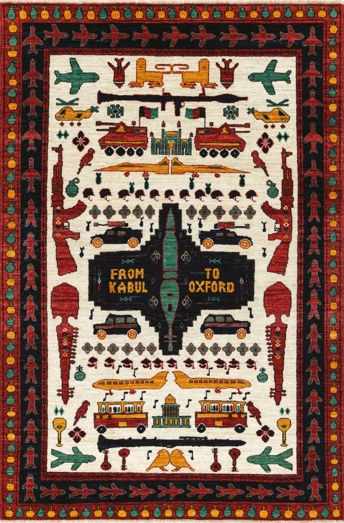
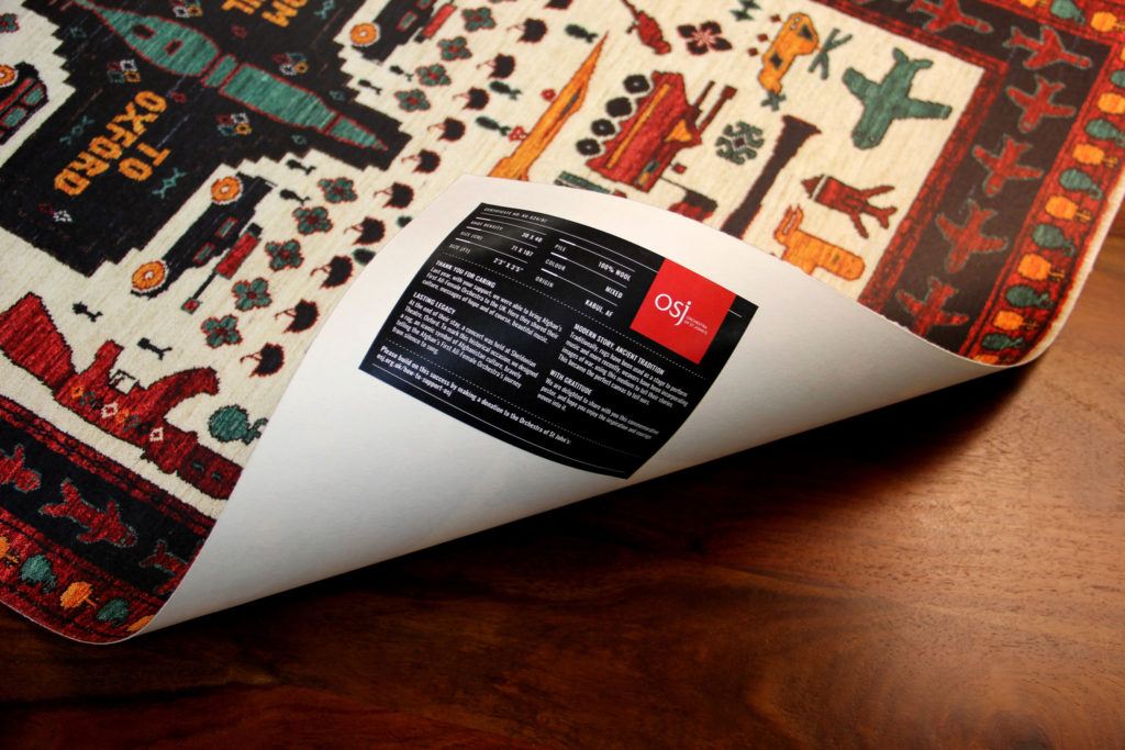
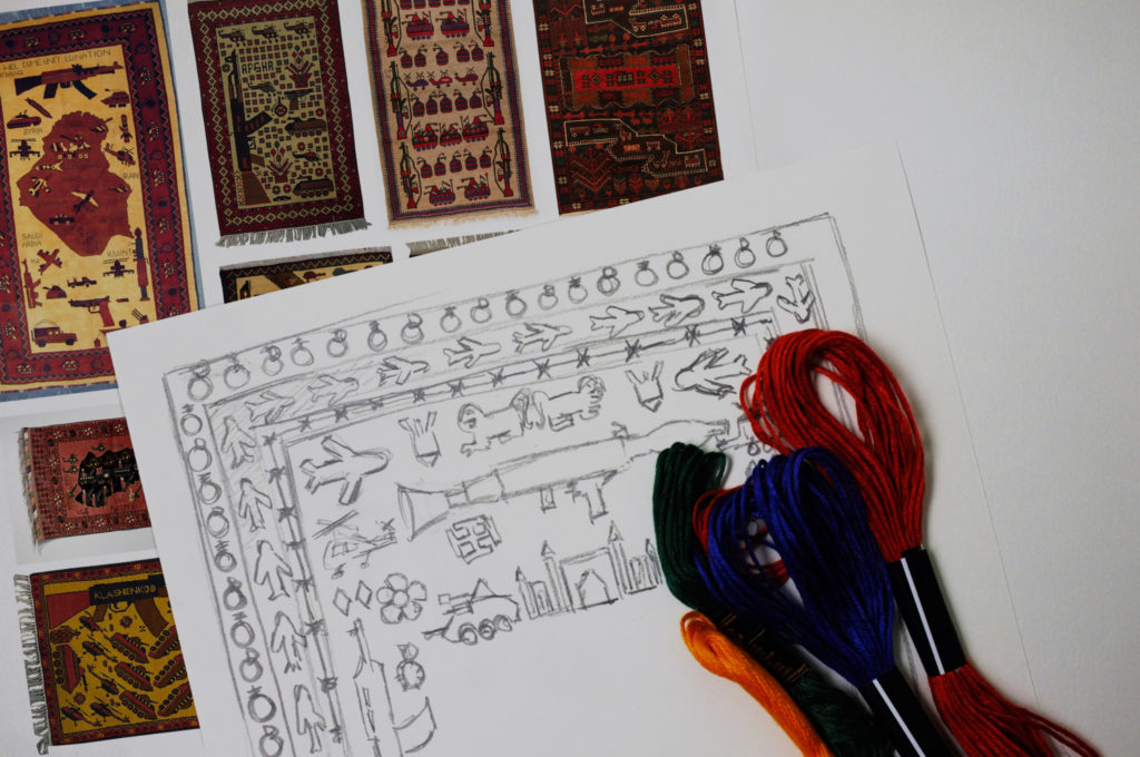
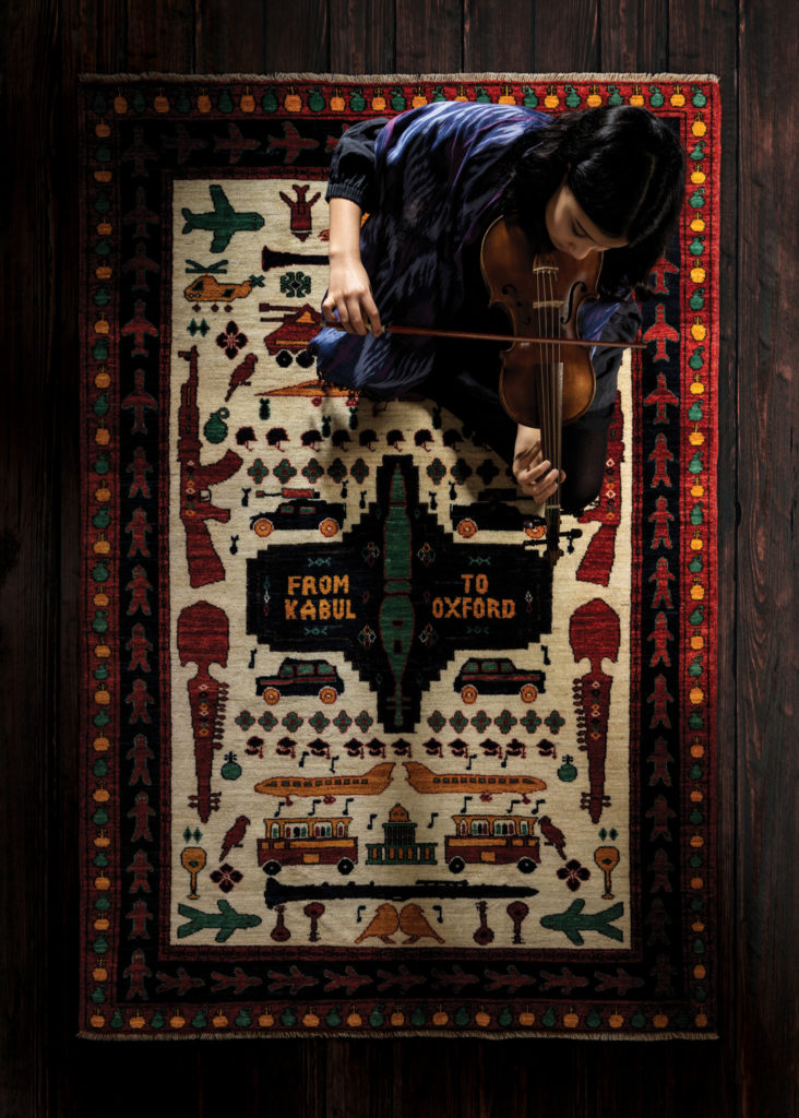
To thank all their supporters, the OSJ asked WMH to create a commemorative poster. We designed a traditional handwoven rug incorporating the apparatus of war depicting the Orchestra’s incredible journey. We commissioned its production with a women’s charity from Kabul and photographed it to create a poster. The posters were sent in a rubble sack which traditionally Afghan rugs get dispatched in.

Together with the Grand Prix this poster received another four Golds in the following categories; Physical Product Design, Poster Design, Illustration and Design for Good.

The Drum Awards Jury’s thoughts:

“The judges felt it impossible to ignore this entry and during the judging sessions found that it covered many categories. We found ourselves on occasion split, then almost-simultaneously unanimously in favour of it. Any Grand Prix award needs to inspire conversation, debate and passion and considering the isolated conditions enforced on us all we found no shortage of exchange. In many ways this piece of work brought us closer together.

“The entry represents many things – a struggle, a journey, resilience, liberation, a story that needed to be told. This story perhaps was the thing that engaged us the most. It inspired rage, disgust and sadness but also a wonderful feeling of optimism and possibility brought through imagination and honest craft. If ever there was a symbol of overcoming adversity and delivering a message of hope, then this is it.“


For any press enquiries email press@wmhagency.com  or call +44 (0) 20 3217 0000. Unless otherwise cited, © copyright 2020 Williams Murray Hamm, all rights reserved.

FABulously Free From

It has been a winning first half of 2019 for Williams Murray Hamm, adding another 16 gongs to its trophy cabinet. The wins include work for Waitrose & Partners, Network Express, Network Rail, 21 Sid, Jewel & Temple, Baerbar and its own 20-year book (Blood, Sweat & Ideas).

Yesterday evening, WMH was awarded a Gold and Silver for its work with Waitrose & Partners. WMH created ‘Free From’, a completely new sub-brand concept for the retailer. The new design presents Free From as a positive, progressive eating choice, regardless of whether you have allergies or not. WMH’s visual identity, including pack designs, had already won several awards, including at New York Festivals, Transform, Creative Pool and Fresh.

The FAB Awards is a prestigious international awards program focused entirely on work done for Food And Beverage industry. It recognises the contribution that outstanding creative work makes to building brands. Entries from over 60 countries across advertising, design, digital and other media makes this a sought after award. WMH’s Free From won a Gold in Brand Redesign, and Silver in Packaging Design. Whilst our work for the London coffee shop, 21 Sid, also picked up a FAB Silver in the Brand Identity category.

As a proud partner of the Branded group, WMH collaborated with sister agency Technik on the artwork production of the Free From 50+ product range. Whilst photography was produced by Jonathan Gregson.

Author: Wybe Magermans – Managing Director.

For any press enquiries email press@wmhagency.com  or call +44 (0) 20 3217 0000.
Unless otherwise cited, © copyright 2019 Williams Murray Hamm, all rights reserved.

Pink gets gold!

It was an evening work of golds and silvers for Williams Murray Hamm. Our work for Ocean Network Express (ONE) was awarded GOLD at last night’s tenth annual Transform Awards Europe. Whilst our Waitrose & Partners Free From design won a SILVER.

ONE is a joint venture between three of Japan’s leading container companies (NYK, MOL and K-Line). The Transform Awards recognised how WMH brought together these three giant shipping companies, found a common purpose and created a differentiating identity that is being deployed across 2m containers and 240 enormous ships. To create this new identity WMH worked closely with Hakuhodo – one of Japan’s foremost advertising agencies.

The silver gong was for WMH’s creation of the Waitrose & Partners Free From range. The new design represents a shift in mindset for “free from” food. The brand is resented as a positive, progressive eating choice, regardless of whether you have allergies or not.

Lastly the WMH campaign for Network Rail at London Bridge Station was highly commended. A campaign that was produced in collaboration with sister agency, Magnet Harlequin.

Established in 2009, the Transform Awards celebrates the transformational power of creativity for brands.  The awards ceremony, hosted by Paul McCaffrey, was held in The Brewery, London.

Brittany Golob, publishing editor at Transform magazine, says, “Recognising 10 years of excellence in rebranding and brand development has been an absolute pleasure for us at Transform magazine. It has also been a joy to observe the development and maturity of the brand industry across Europe and to see business leaders recognise the power of brand.”

Author: Wybe Magermans – Managing Director.

For any press enquiries email press@wmhagency.com  or call +44 (0) 20 3217 0000.
Unless otherwise cited, © copyright 2019 Williams Murray Hamm, all rights reserved.

Italian Hand Gestures and Traditional Etchings Inspire Design for 21 Sid

Brand strategy and design agency Williams Murray Hamm (WMH) has designed a visual identity for London-based coffee shop and bakery 21 Sid, which builds on the importance of hand gestures in Italian communication.

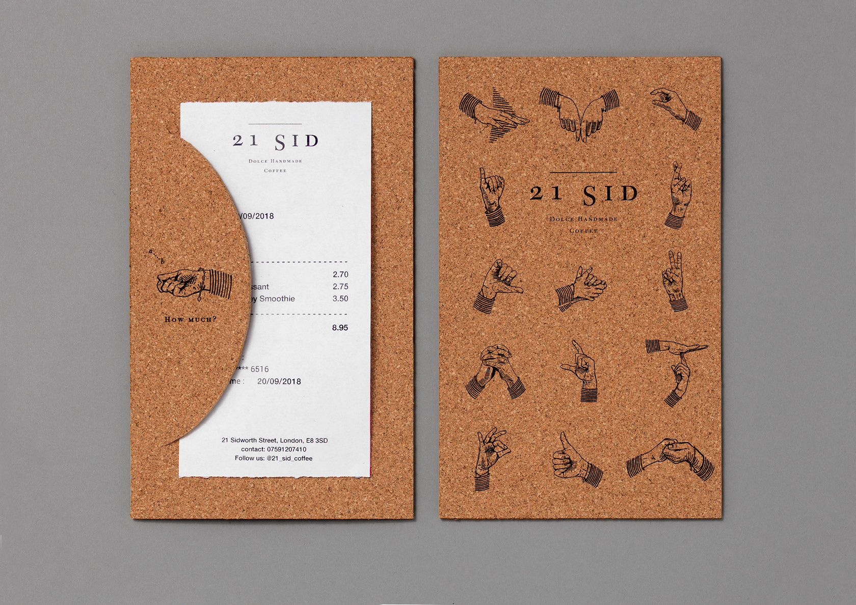
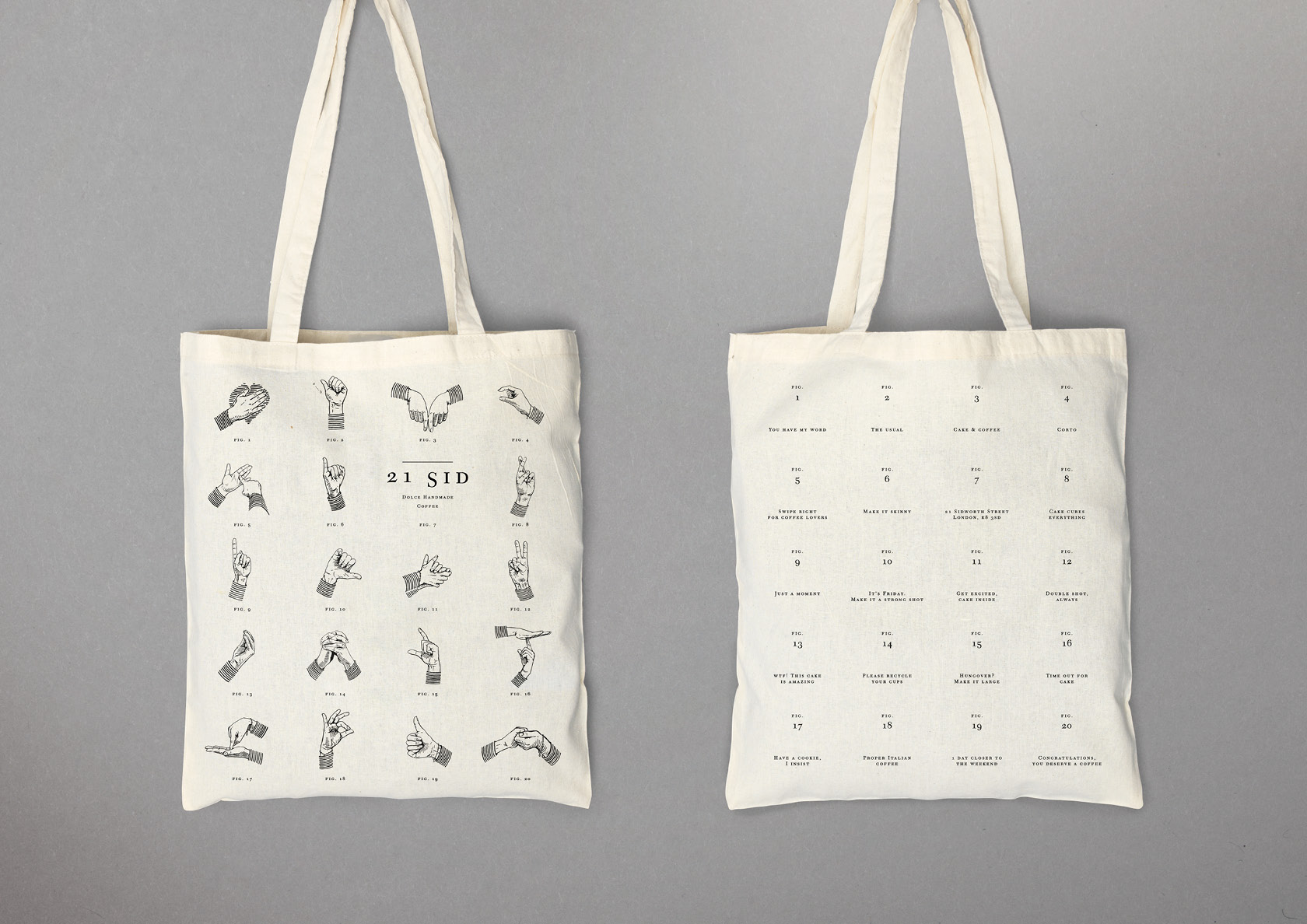
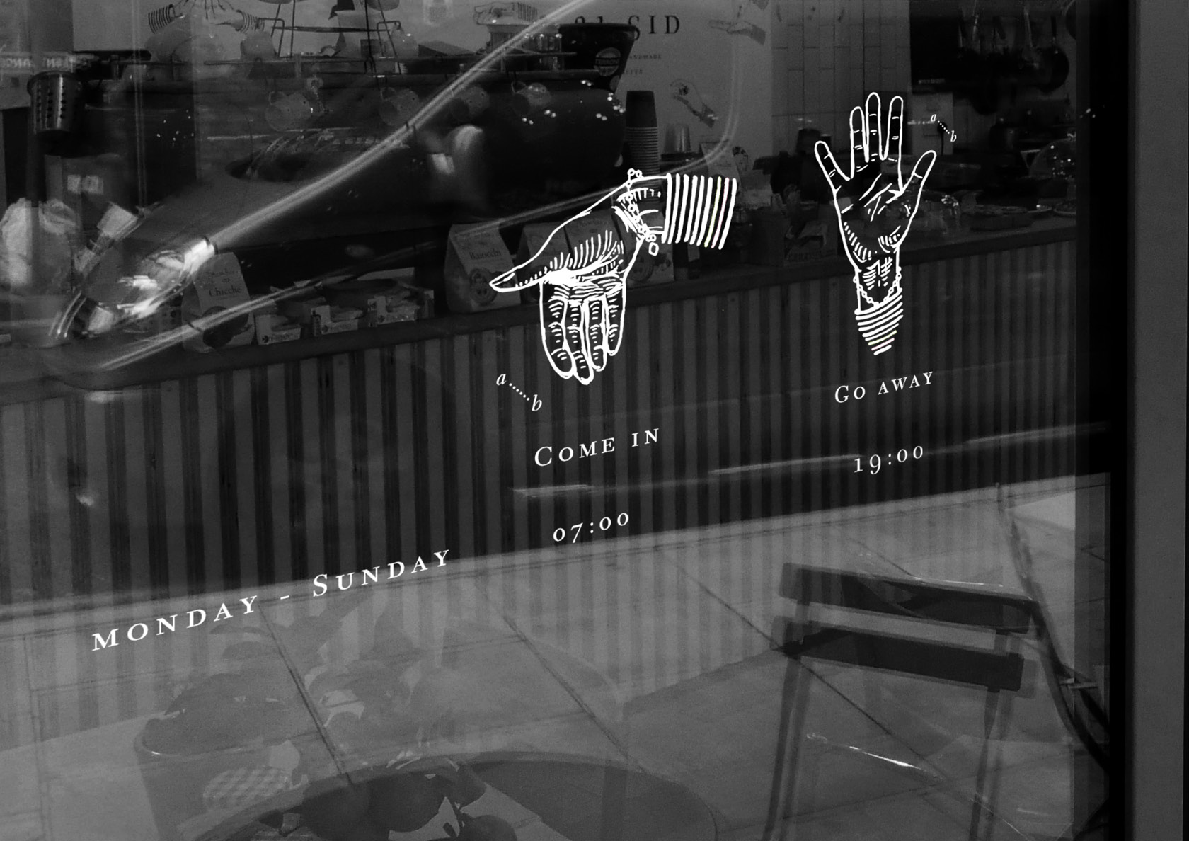
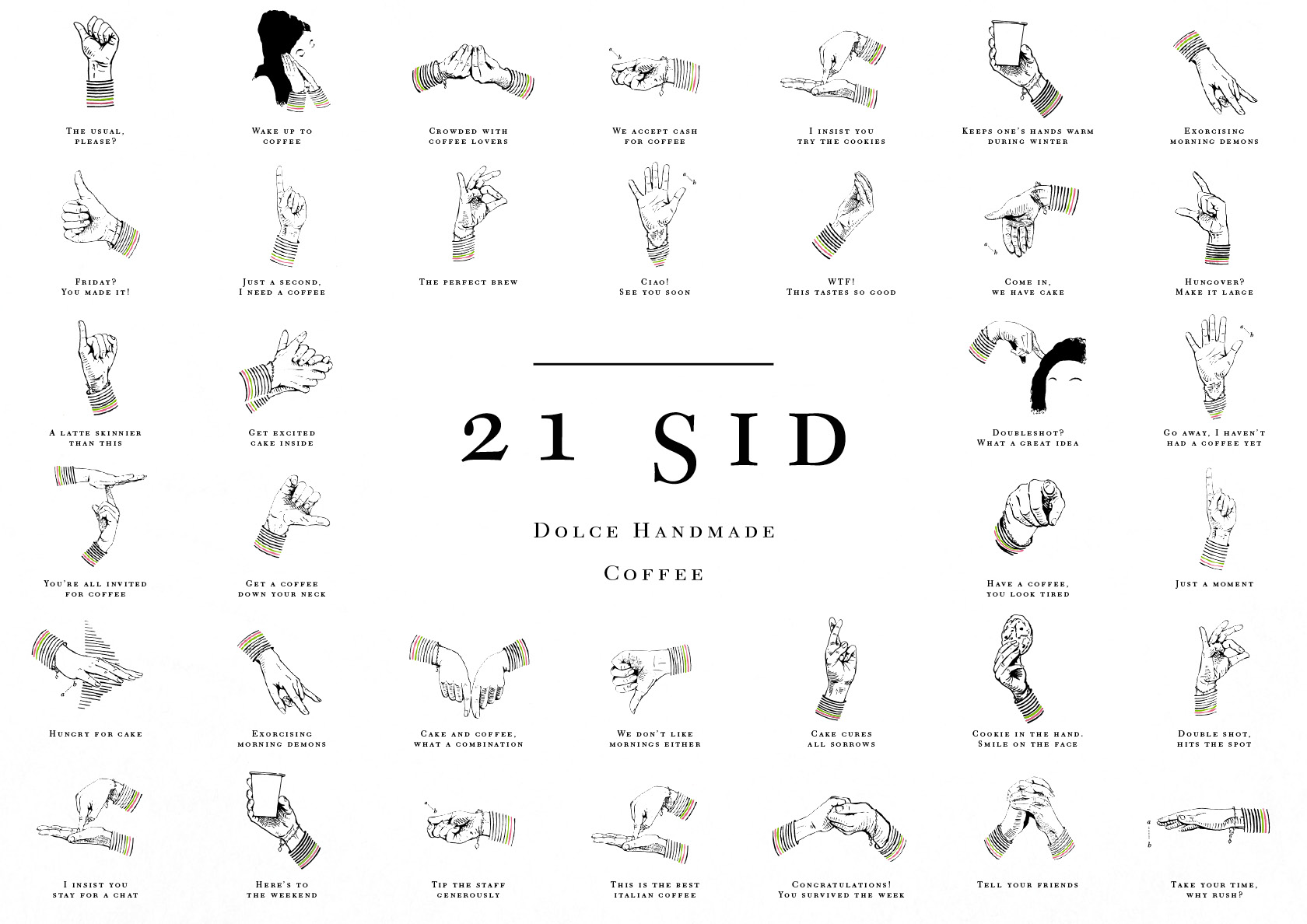
21 Sid, near London Fields in East London, is run by self-taught baker Laura Giovanna Lo Faro, who supplies baked goods to numerous cafes around London and bakes goods for her café on site.

With a myriad of independent coffee shops in London, creating a personal and unique brand for Laura’s business that went beyond a simple typeface or set of colours and was capable of not just standing out but engaging customers emotionally was key.

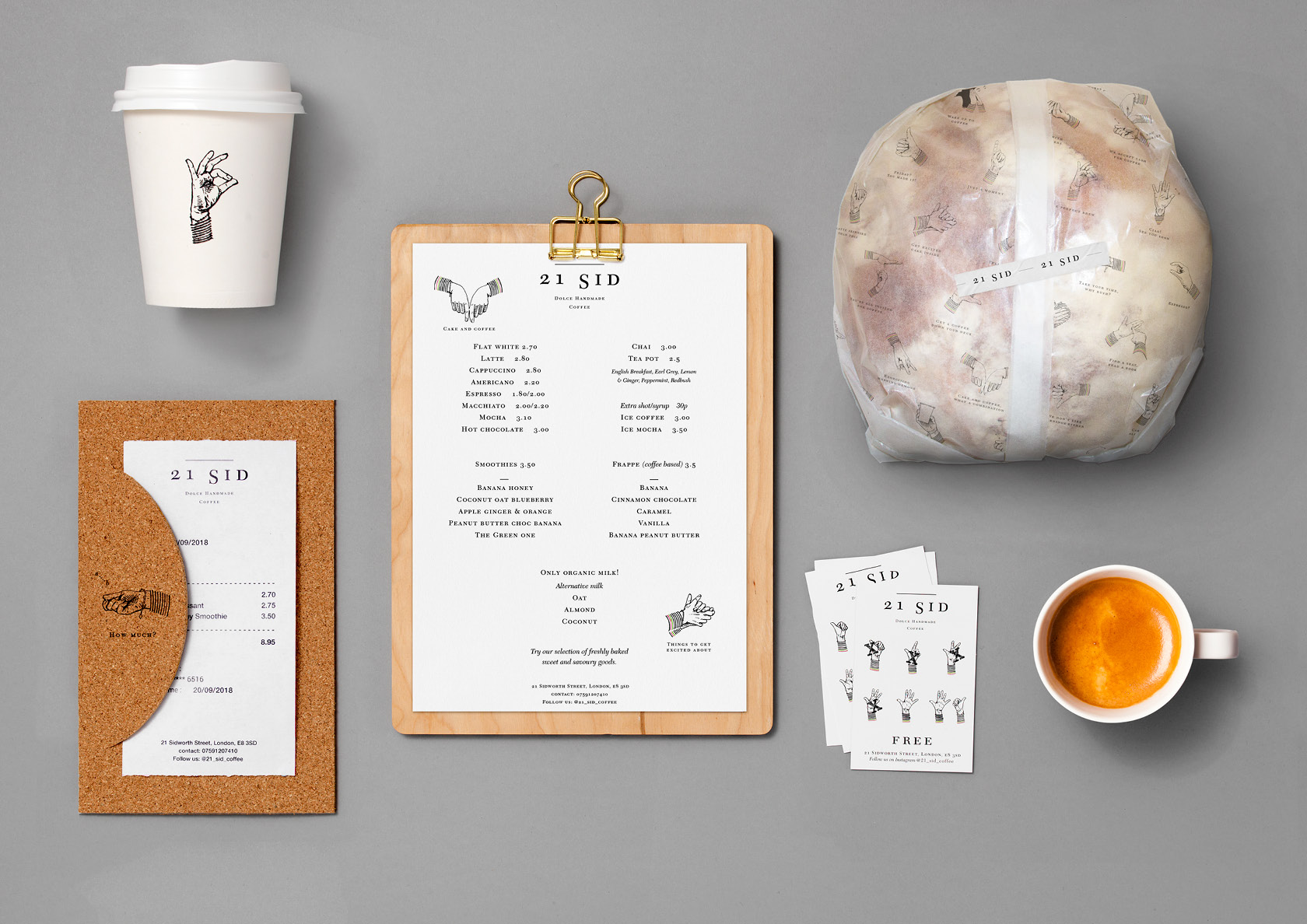
WMH’s solution is a visual identity based on the theme ‘Dolce Handmade’ – to reflect Laura’s handy skills both as a cook and also a passionate communicator – and ‘Liquid Perfection’.

The agency commissioned Italian illustrator Gabriele Grassi to capture, in a series of unique illustrations, a wide range of Laura’s hand gestures which are typical of the exuberance of Italian communications.

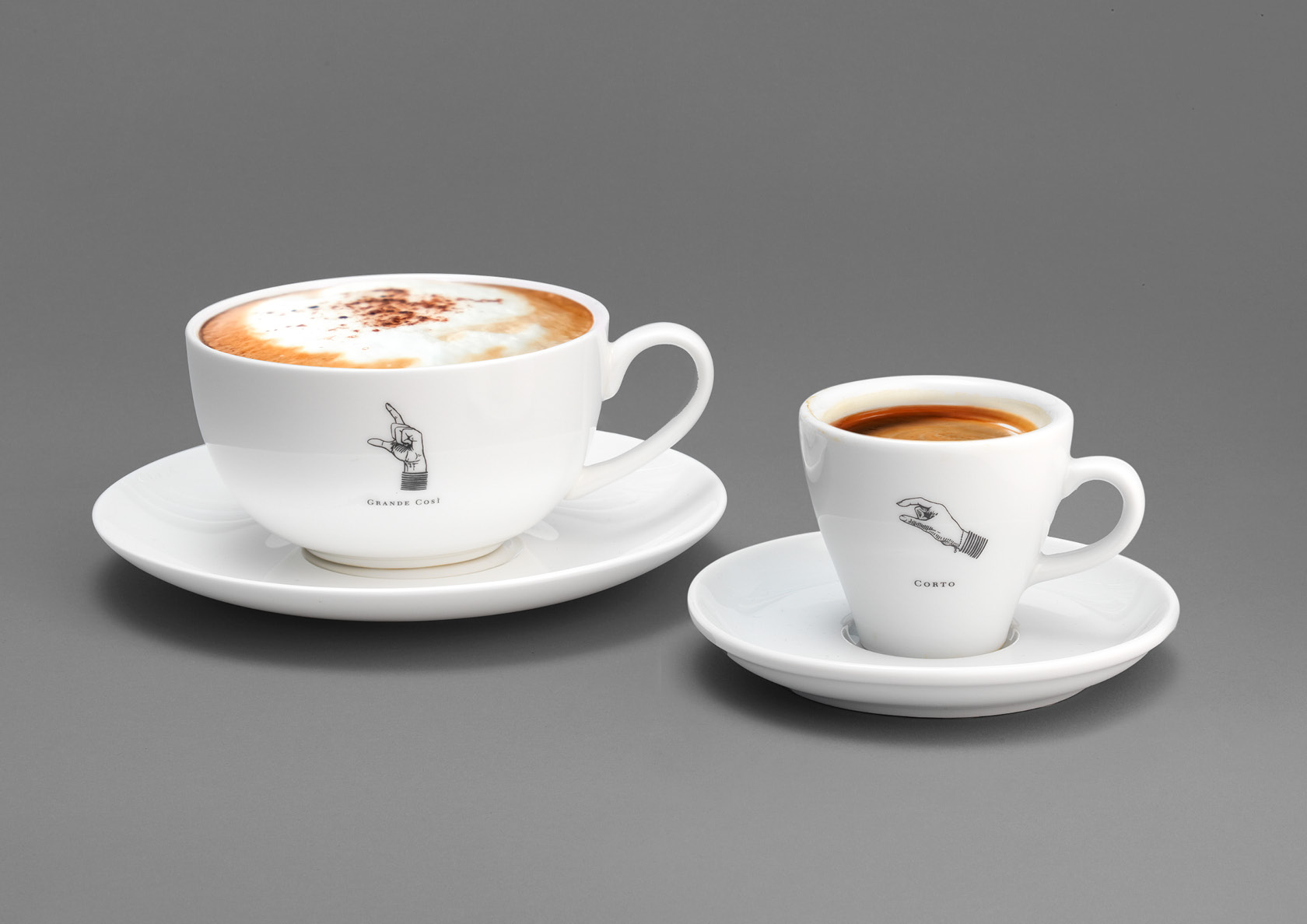
The hand-drawn, monochrome, illustrative style is inspired by traditional etchings and encyclopaedias.

The branding comprises dozens of illustrated hand signals, such as a raised hand with a raised forefinger (denoting ‘Just a second I need a coffee’); a closed hand with a raised pinkie (‘A latte skinnier than this’); and two hands rubbing together (‘Get excited, cake inside’).

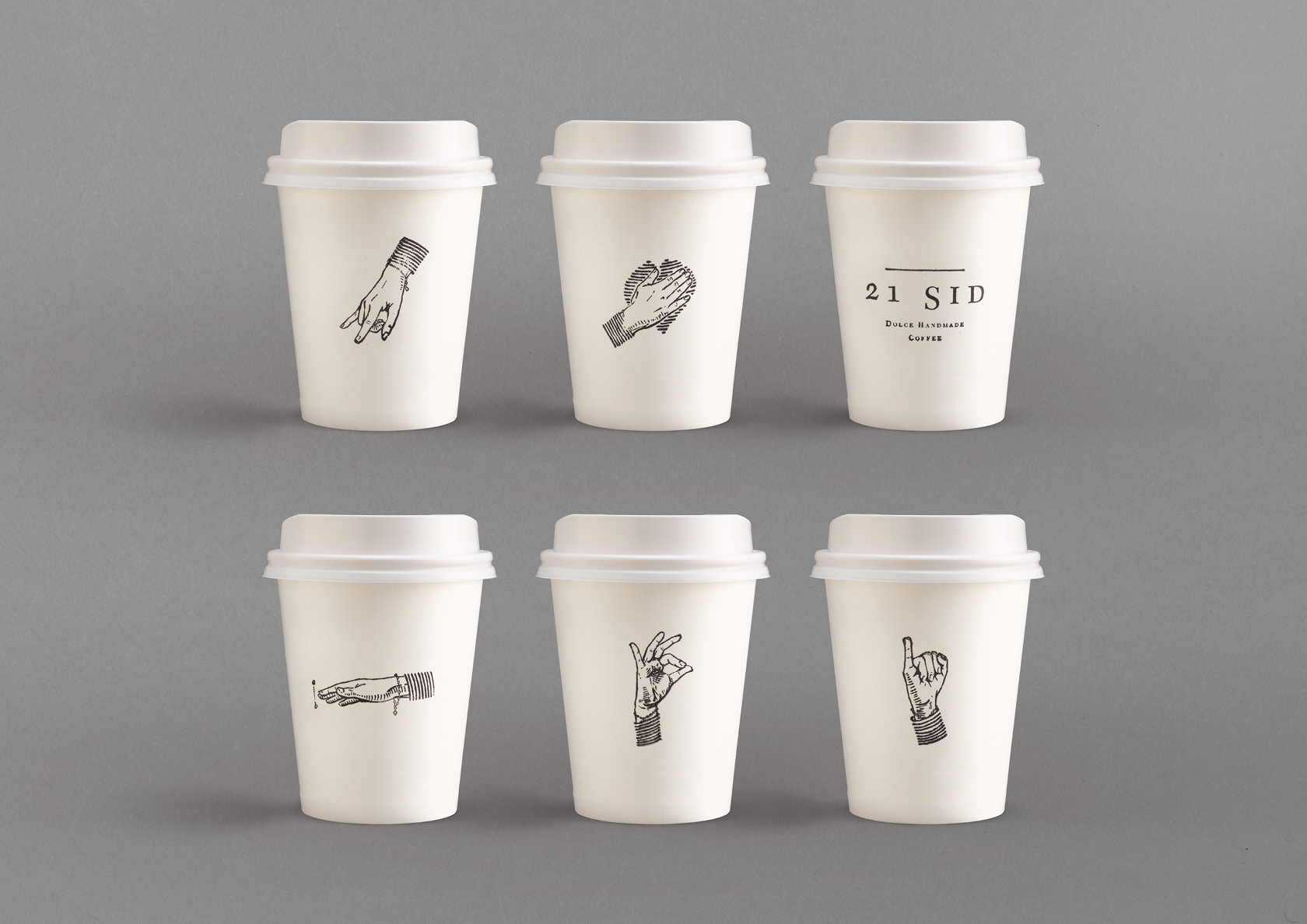
The designs – which were done pro bono by the WMH team, who are regulars at 21 Sid – is being used across a wide array of items including badges; bills; staff aprons; cups and wrapping as well as in-store.

Garrick Hamm from WMH commented: “Hand signals can communicate as much as words, especially in Italian culture. Having bought our morning coffees from Laura for many months, we immediately knew that the branding for her coffee shop would need to reflect her personality, her Italian heritage, her passion and her charisma.”

Laura added: “Williams Murray Hamm has created a beautiful visual identity for the business, with the iconic hang gestures helping to convey the trust and the affection that we hope our customers feel when they walk into 21 Sid.”

By 

For any press enquiries email press@wmhagency.com  or call +44 (0) 20 3217 0000.
Unless otherwise cited, © copyright 2019 Williams Murray Hamm, all rights reserved.

Castrol Bio-Synthetic wins at TDC 2017

We are pleased to announce that Castrol Bio- Synthetic, our entry in the TDC Communication Design Competition has won a ‘Certificate of Typographic Excellence’

The work was selected from from over eighteen hundred entries from fifty countries.

A high performing job all round.

04_Castrol_Biosynthetic_typeface


For any press enquiries email press@wmhagency.com  or call +44 (0) 20 3217 0000.
Unless otherwise cited, © copyright 2017 Williams Murray Hamm, all rights reserved.

Castrol Bio-Synthetic

WMH has launched a new ‘bio’ variant of the Castrol EDGE and Castrol MAGNATEC brands that includes 25% of oil derived from plant sources.


Whilst this is not the first launch of a bio-derived oil, it is the first by a global major company. Castrol’s clever engineering and cutting edge technology have made it possible to take plant oil (and its natural lubricating qualities) in combination with traditional fossil-based oils to create a bio-lubricant that protects as well as standard Castrol EDGE or MAGNATEC.

“Pioneering with plants” – we brought together this natural tension creating a world and visual language unique to Castrol Bio-Synthetic oils. The new design stretches across film, packaging and web banners.

wmh_castrol_edge_biosynthetic_film_still_1

wmh_castrol_edge_biosynthetic_film_still_2

wmh_castrol_edge_biosynthetic_film_still_3

wmh_castrol_edge_biosynthetic_film_still_5

wmh_castrol_edge_biosynthetic_packaging

For any press enquiries email press@wmhagency.com or call +44 (0) 20 3217 0000.
Unless otherwise cited, © copyright 2016 Williams Murray Hamm, all rights reserved.

In Fondest Memory of Geoff Appleton: 1950 – 2016

wmh-in-memory-of-geoff-appleton-1950-2016-011216

A celebration of an infectious spirit and an incredible talent.

Today, it is with great sadness and a heavy heart that we bid a final farewell to our beloved friend and illustrator extraordinaire, Geoff Appleton, following a battle with pancreatic cancer. During a year that has seen the loss of many great talents, we will remember and celebrate Geoff’s memory as one of the greatest.

Williams Murray Hamm co-founder, Richard Williams, remembers Geoff’s infectious spirit:

“I’ve been at Williams Murray Hamm for 20 years and I can honestly say that I’ve not seen a freelancer more loved by our people and our clients than Geoff.

 They broke the mould when they made him. He was the last of a breed of artists who could earn a good living by drawing on paper and never doing stuff he didn’t want to do.

 We’ll miss his jolly banter and his great work and, in particular, I’ll miss talking to him about the finer points of Bob Dylan…” 

Our thoughts are with Geoff’s family and to commemorate his legacy WMH has made a donation to his nominated charity, Children and the Arts.

Children & the Arts is an independent educational charity that engages with disadvantaged children nationwide who do not have access to high-quality arts activity because of either social or economic barriers… [read more]

If you wish to make a donation in memory of Geoff, please visit www.childrenandarts.org.uk.


For any press enquiries email press@wmhagency.com  or call +44 (0) 20 3217 0000.
Unless otherwise cited, © copyright 2016 Williams Murray Hamm, all rights reserved.

WMH wins Silver at FAB Awards for Penny Market ‘Orto Mio’ redesign

Williams Murray Hamm’s brave, bold and engaging design for Penny Market’s ‘Orto Mio’ antipasti range was awarded a Silver at last night’s International Food & Beverage Awards.

image2

Now in their 18th year, the FAB Awards are focused entirely on work done for Food and Beverage brands. They recognise the critical contribution that outstanding creative work makes in building brands, identifying and rewarding leading practitioners from over 60 countries.

Rewe owned, Penny operates 3,550 stores in Europe. Having won a written competitive pitch against two other agencies, WMH was appointed to rejuvenate the 45+ antipasti range to reflect a more unconventional and approachable image for Orto Mio.

WMH-PENNY-ORTO-MIO-REWE-BEFORE-AFTER-WEB

WMH’s new design embodies the relaxed, sociable style of eating antipasti. It suggests that the food can barely be restrained by its packaging and is bursting to get out with colour and flavour

WMH-PENNY-ORTO-MIO-REWE-JARS-WEB

The illustrations work in unison with lively, colourful hand drawn typefaces. Each product carries a witty copyline, such as ‘oh la la olives’, ‘we are the champignons’ and ‘you make me blush’, continuing the promise of an enjoyable eating experience.

On winning the award Garrick Hamm, Creative Director at WMH said:

“We are overjoyed that our work on ‘Orto Mio’ has been recognised by the FAB Awards.  Hopefully, the witty design raised as much of a smile on the judges’ faces, as the award has on ours!”

image1

WMH-PENNY-ORTO-MIO-REWE-WALLPAPER-WEB

WMH wins coveted D&AD Yellow Pencil!

WILLIAMS MURRAY HAMM WINS D&AD YELLOW PENCIL FOR UK EROTICA BRAND, COCO DE MER

Williams-murray-hamm-coco-der-mer_D_AD_Pencil-yellow-2016
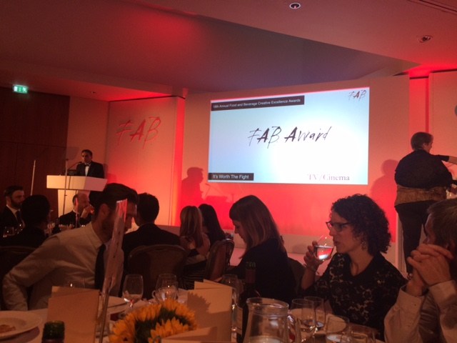
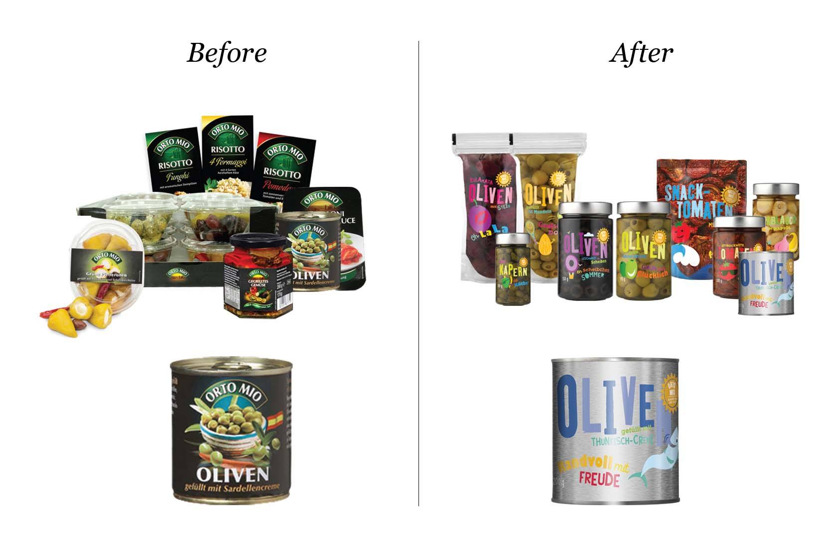
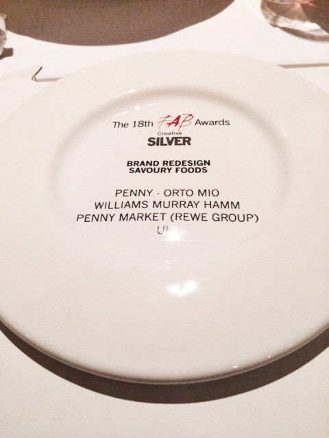
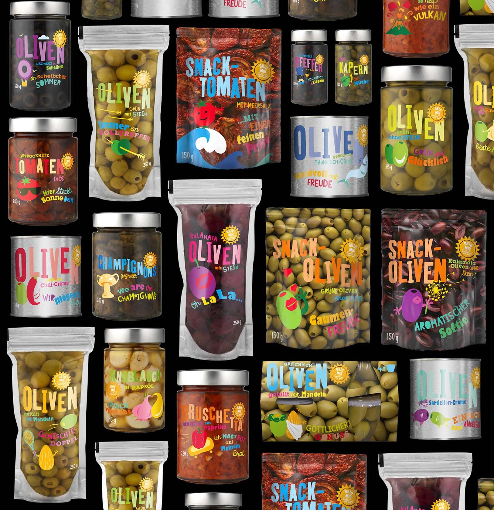
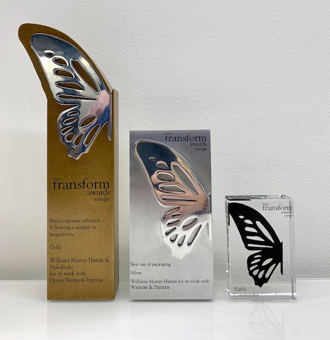
Tonight, WMH was awarded a coveted D&AD Yellow Pencil for its packaging design work for Coco de Mer.

D&AD (Design and Art Direction) is a world renowned British educational charity that promotes excellence in design and advertising. The annual awards as regarded as one of the major events in the creative world and a ‘Yellow Pencil’ is the equivalent of a gold award.

On winning the award, Garrick Hamm, Creative Director of Williams Murray Hamm said:

“I dedicate this pencil to Dick Murray. Once asked, if his house was burning down what would he grab, he said ‘just his yellow pencil. ‘Jelly Man’ would have been out tonight for sure. Also, a huge thank you to Coco De Mer for being such a wonderful client”.

This award continues WMH’s extraordinary year. Having won Gold in the DBA Design Effectiveness Awards in January for its work on soft drink JuiceBurst, WMH’s Coco de Mer design has won a Mobius award, ‘Best in Book’ in Creative Review and a Drum Design award.   

WMH-COCO-DE-MER-RANGE-OUTER-WEB

Luxurious, enticing and empowering, Coco de Mer is where you “explore the exhilarating limits of your erotic imagination”. Online and in their London boutique, they collect and curate only the finest erotica to “inspire exploration, excitement and enjoyment”.

WMH’s new identity for Coco de Mer involved a gently recrafted logo and a changed, more exotic colour scheme of gold and deep red derived from the successful and eclectic store interior.

The most talked about aspect of the redesign was the creation of packaging for a new ‘signature’ range of luxury toys and lubricants inspired by history’s Grandes Dames of seduction.

WMH-COCO-DE-MER-RANGE-INNER-WEB
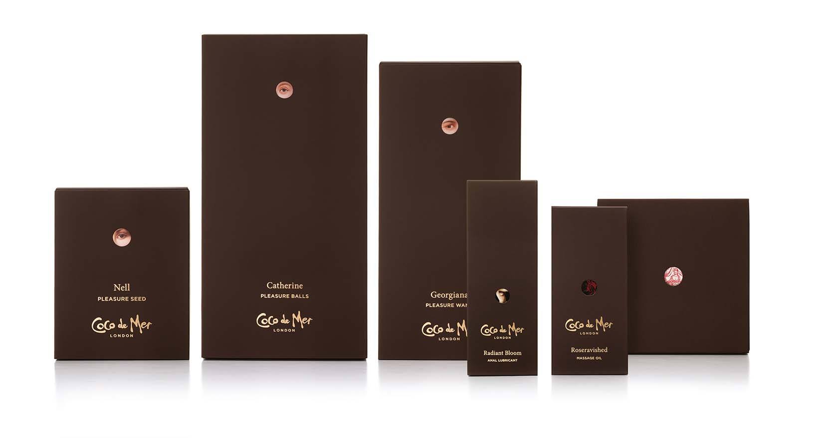
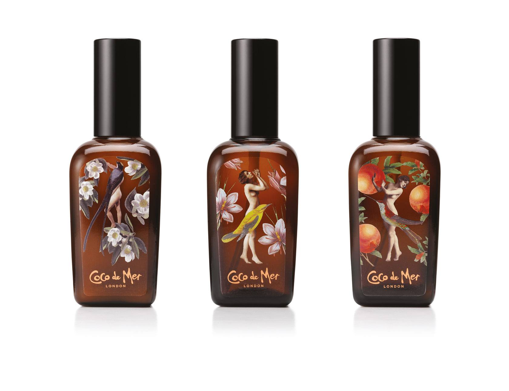
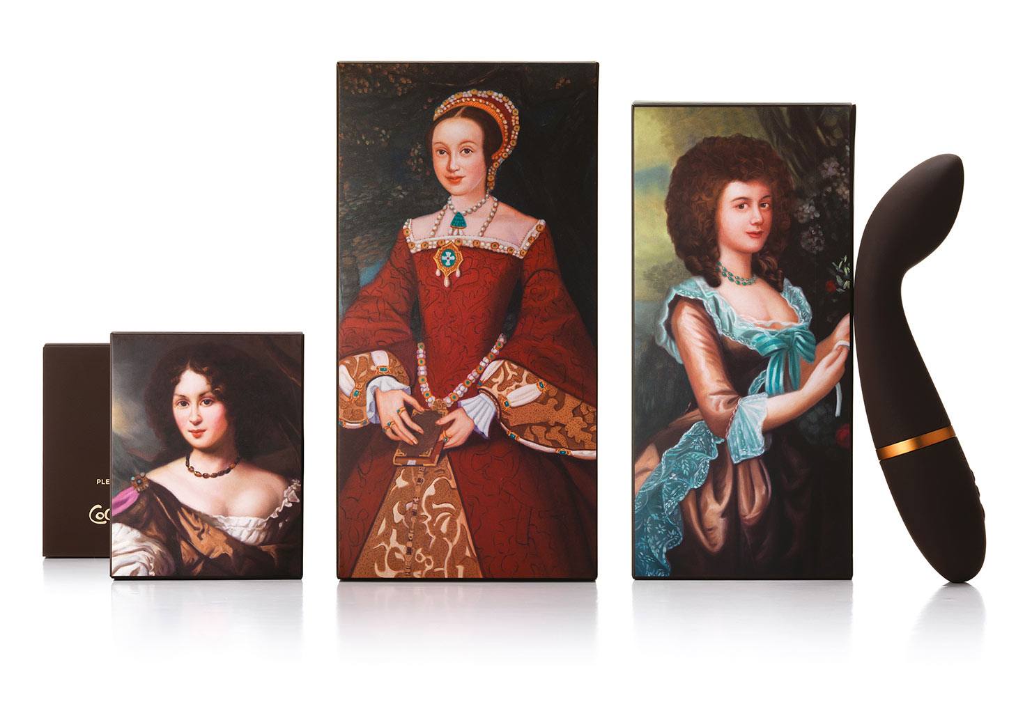
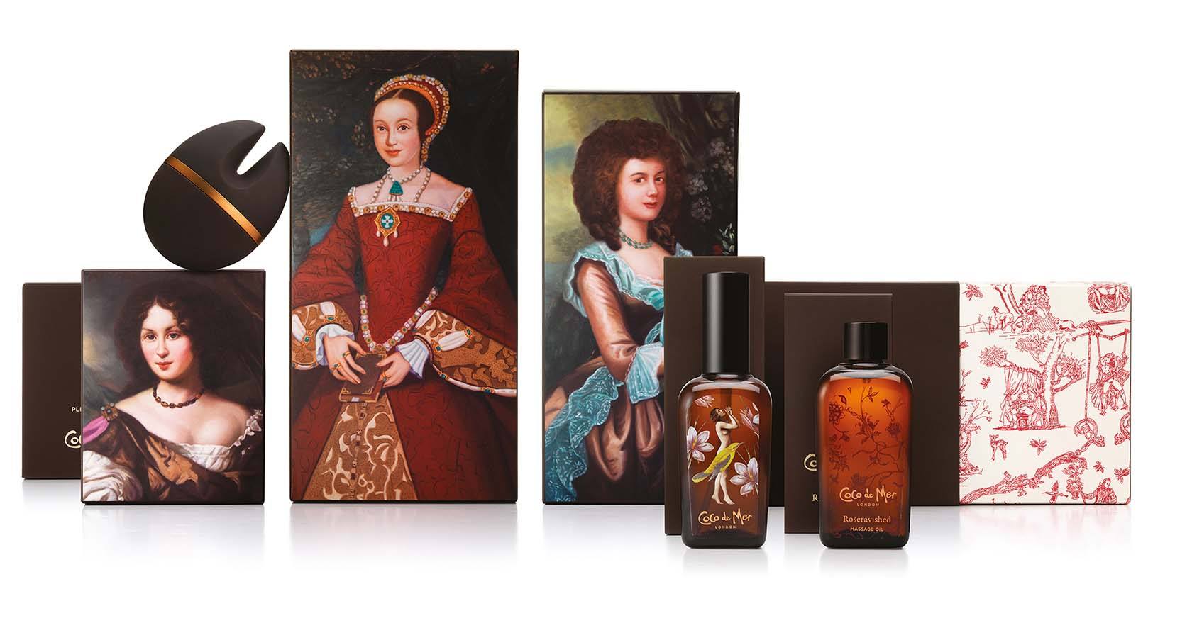
These feature erotic images of nude women, botanical prints and portraits of three historical figures whose sex lives were notorious: Catherine Howard, former Queen of England and wife of Henry VIII, who was beheaded for adultery; Georgiana Cavendish, the Duchess of Devonshire, whose affairs were portrayed in 2008’s film ‘The Duchess’; and Nell Gwynne, the long-term mistress of King Charles II.

Inspired by the legendary peephole in the original Covent Garden store’s changing room, a small hole in an outer sleeve offers a teasing glimpse of the seductress behind, who looks back knowingly at the viewer.

Lucy Litwack, Managing Director at Coco de Mer said:

“It was an enjoyable and captivating journey to develop our new Pleasure Collection packaging with Williams Murray Hamm and we are delighted that the work has been recognised with so many awards. It was a great opportunity to collaborate with an agency which truly understood our values and developed designs that embraced our vision. Well deserved congratulations to the remarkable team who worked with us on this project.”    

The product range is available online and in Coco de Mer’s Covent Garden flagship store.

For any press enquiries, please email press@wmhagency.com or call +44 (0) 20 3217 0000.

WMH awarded Creative Review’s ‘Best in Book’ for Coco de Mer

WMH 2016 COCO DE MER NELL GWYNNE

WMH has been awarded the esteemed ‘Best in Book’ by design publication Creative Review for its packaging design work for Coco de Mer.

The Annual is Creative Review’s showcase of the best visual communications work of the year. Trusted by the industry, it celebrates great work and supports those who produce it by offering a platform for it to be seen, both by peers and potential clients from the wider creative community.

Luxurious, enticing and empowering, Coco de Mer is where you “explore the exhilarating limits of your erotic imagination”. Online and in their London boutique, they collect and curate only the finest erotica to “inspire exploration, excitement and enjoyment”.

Williams Murray Hamm created a revised identity and new packaging to reinforce Coco de Mer’s luxury positioning across their range of toys, oils, lubricants and candles as well as shopping bags, brochures and more.Coco de Mer lubricant bottles designed by WMH Pleasures Collection

The highlight of the work, the packaging for a range of luxury toys, features portraits of some of history’s grand-dames of seduction: Nell Gwynne, Georgiana the Duchess of Devonshire and Catherine Howard. In a nod to the idea of excitement and discovery their portraits are glimpsed through a teasing peephole on outer boxes.

A complimentary and sophisticated colour palette of teal, black, ceramic, clementine, ‘Coco gold’ and red has been introduced with the typography and Coco de Mer marque redrawn in glorious gold.WMH coco de mer erotic sex toys packaging Nell Gywnne Georgaina Cavendish Catherine HowardOn winning the award, Garrick Hamm, Creative Director of Williams Murray Hamm said:

I’d like to thank all the good people who worked on this work, from WMH and Coco De Mer. If you can dream it, you can make it, but only if you have a like minded client. The dreaming is the easy bit, Thank You Coco de Mer’.

The product range is available online and in Coco de Mer’s Covent Garden flagship store.

WMH’s design for the brand recently won Gold and the Grand Prix at The Drum’s Dream Awards, Gold at The Fresh Awards and a Mobius Award.

I’m looking for simplicity

Lamb Weston
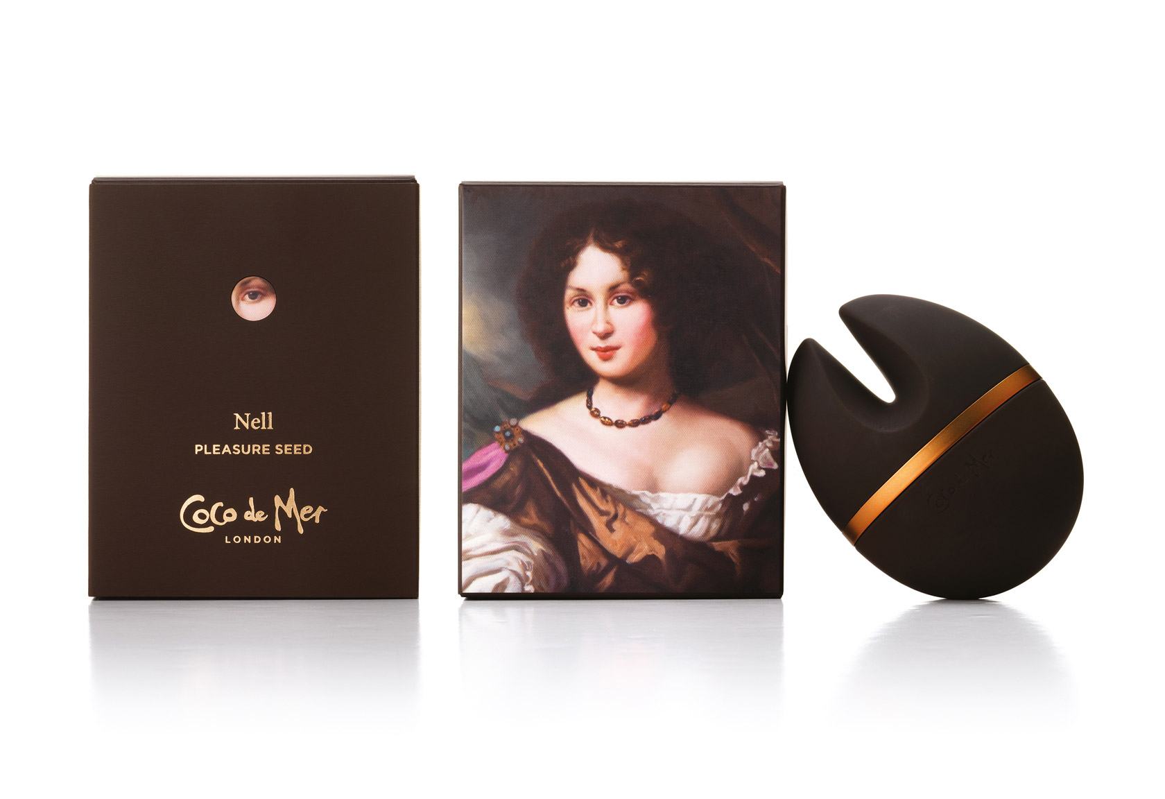
I have discovered that, at the age of 66, I’m at the leading edge of thinking.

I’m behaving like a Millennial.

I was drawn to a poster for Nigella Lawson’s new book ‘Simply’ because simplicity has been on my mind lately. I’m clearing my life of things I don’t need.

If I love it, or it has serious sentimental value or it makes my life easier it stays, if not, it goes.

For years people have been telling me to buy a second home, but why do I want another set of windows to paint, lawn to cut and bills to pay? If I want a house for the occasional weekend, I’ll rent one.

I’m looking for a simpler, less stressful life.

According to Blake Morgan, in Forbes magazine, Millennials don’t want possessions, they want experiences. Go to the concert, but don’t burden yourself with buying the album. If you want to hear it, go on Spotify. If you need to get around, use public transport or pick up a ZipCar.

Technology is feeling the pain too. We’re keeping things longer. According to the WSJ, we’re buying fewer televisions because we’re watching TV on our tablets and we don’t see the value in upgrading to the latest TV gizmo every few years. The growth in SIM only deals is because that new phone upgrade and costly contract isn’t as tempting as it was. Do you really need to pay top dollar for a slightly better phone?

Clearly, this shift towards simplicity will have a serious effect on what we buy and, from a designer’s perspective it will make for an interesting time. Great design has always been about editing out the stuff that’s not relevant. It helps people make decisions by giving brands and businesses clarity in a complex world.

It’s what we’ve just done for Lamb Weston a huge potato business in the cut throat world of food services. we’ve got it down to one thing – ‘Seeing possibilities in potatoes’. Bingo!

Of course, we’re just being Millennial. It is time for the marketing world to catch up, to cut out the complication and ask ‘What’s the one thing you want people to understand about your brand and how can you get it into the heads of a busy distracted population?

Author: Richard Williams