Barclays Bank
Visually talking ‘fluent in finance’ whilst giving back its eagle.
BACKGROUND
Seismic changes in financial services prompted many providers to adopt a familiar approach with their customers. Not Barclays. This wasn’t appropriate for one of the word’s best-established global banks.
STRATEGY
Playing to their strengths, Barclays focused on being the best place for customers’ money, run by people ‘fluent in finance’. This was in stark contrast to the competition who came across as being more like their customers’ best friends than financial experts.
SOLUTION
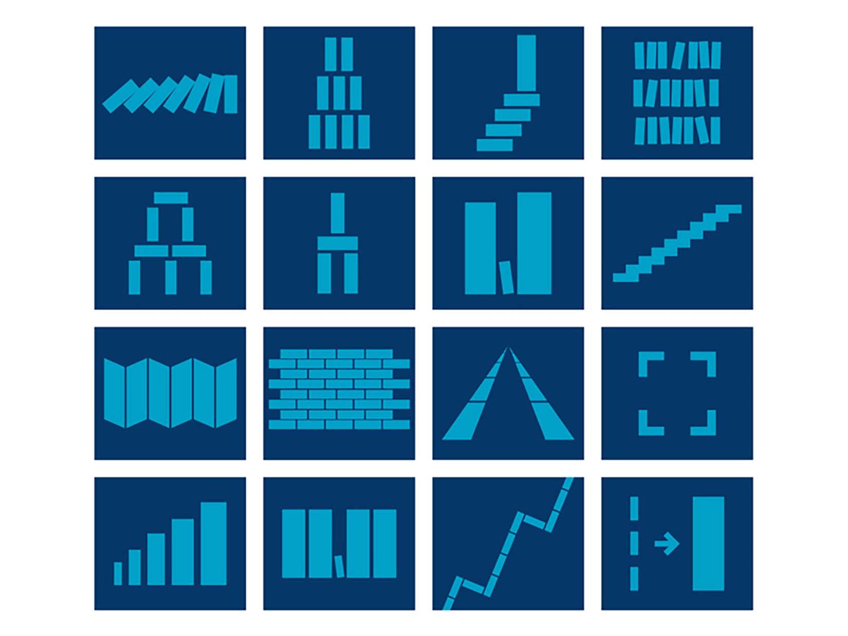
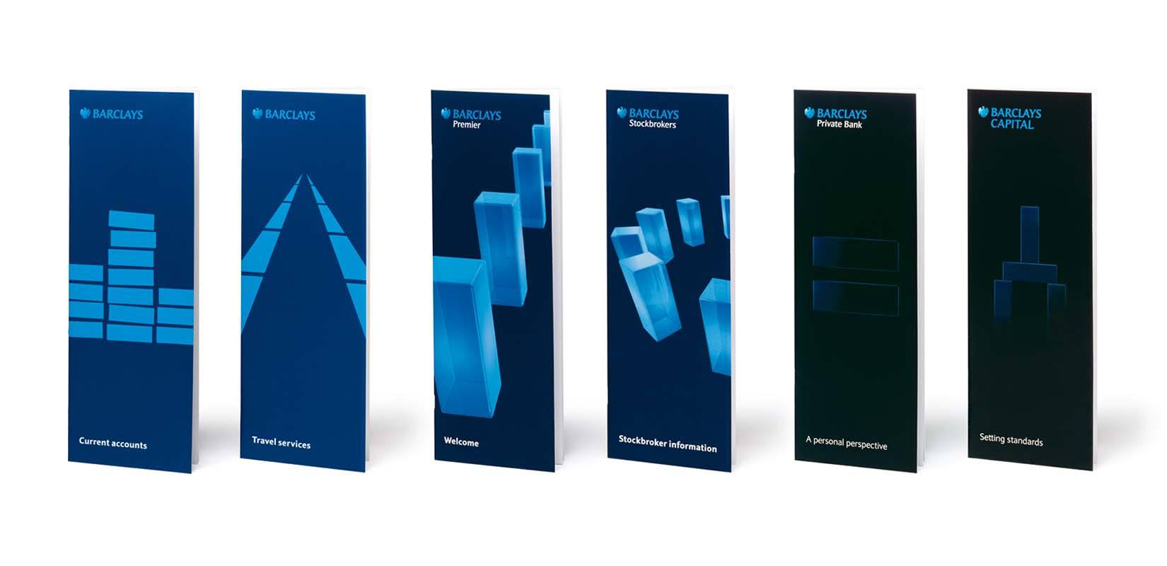
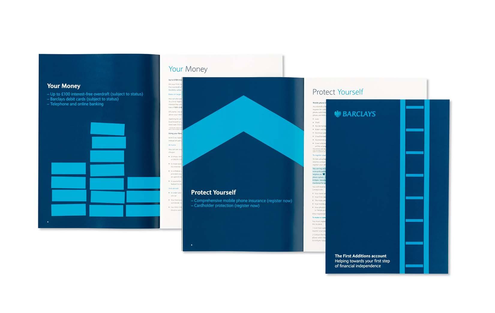
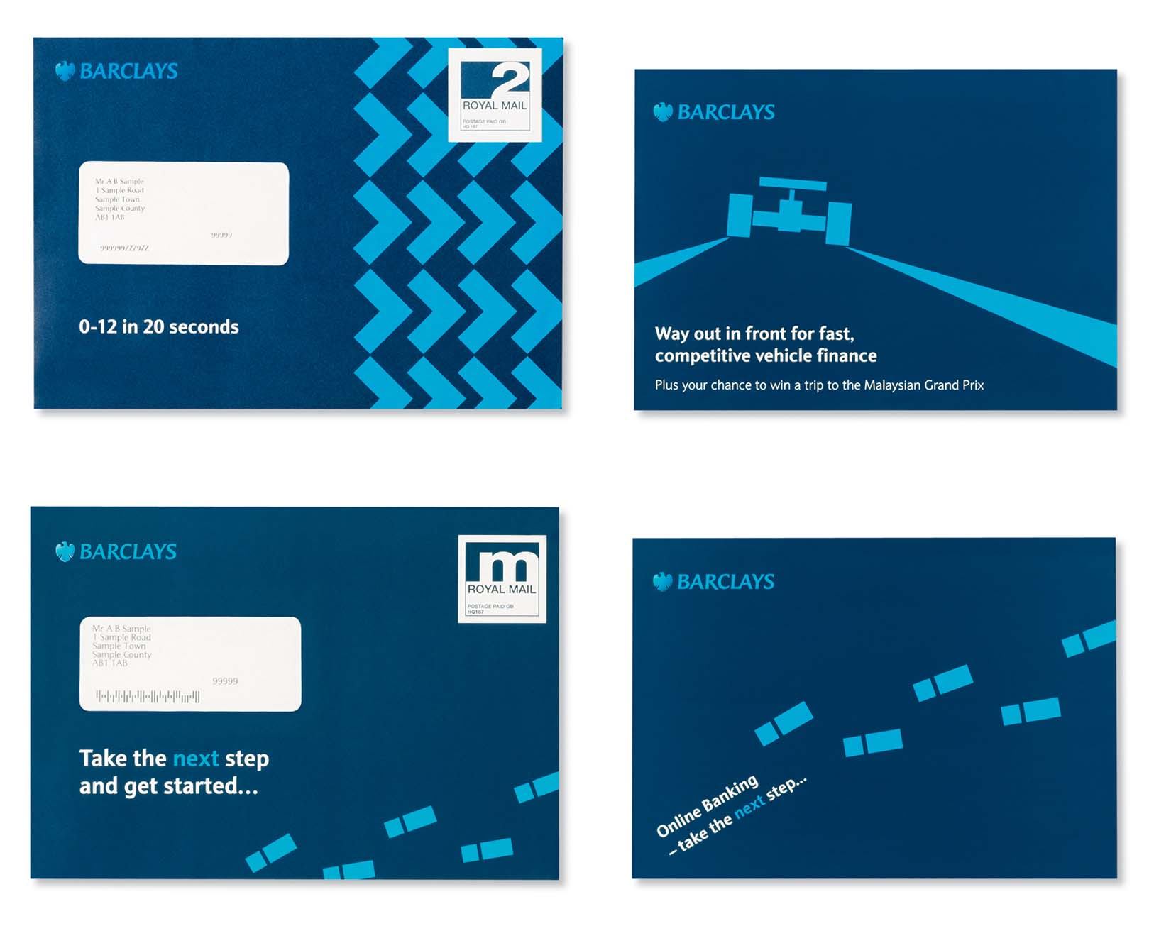
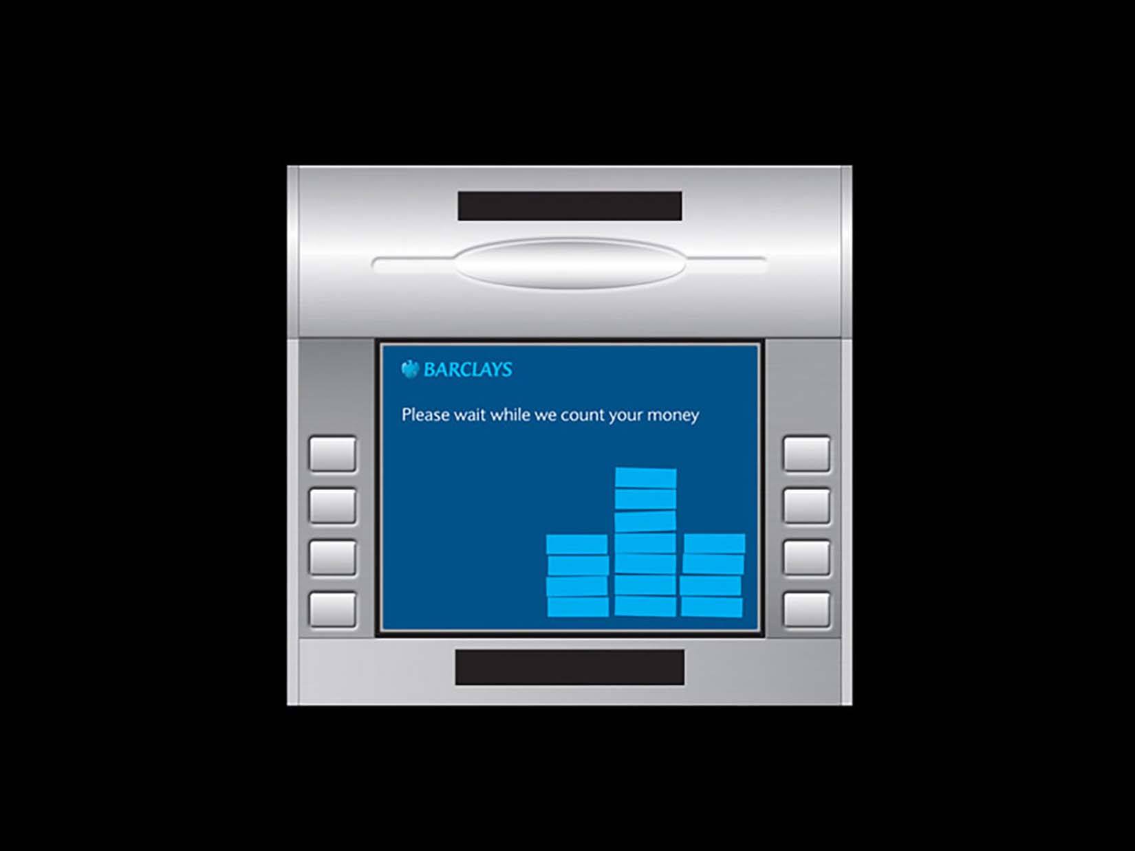
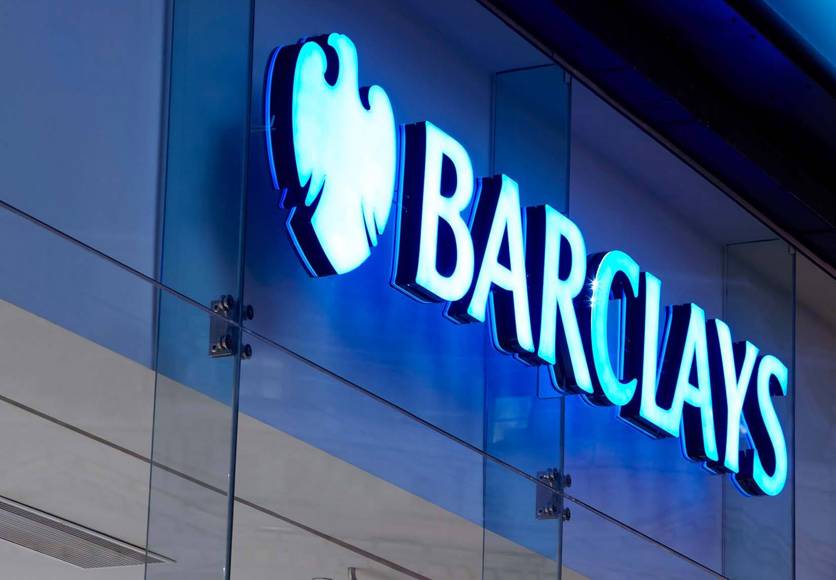
WMH strengthened and simplified the Barclays eagle and introduced solid blue panels that offered the opportunity to create a wide range of animations and marketing messages. To strike the right tone and keep things businesslike, the use of people as part of the imagery isn’t allowed. The new design was implemented on core sites within six months and is now global.