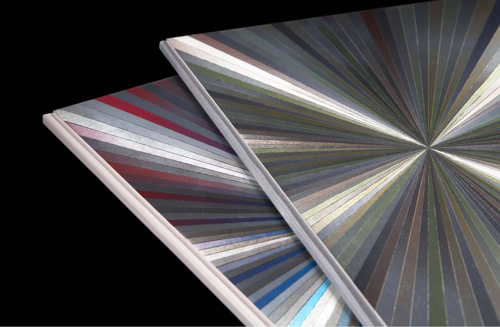
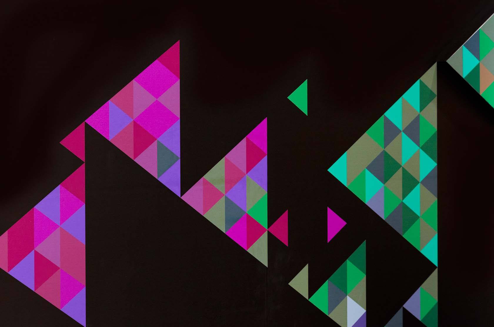
Way to Blue
A switched-on identity for a switched-on communications agency.
BACKGROUND
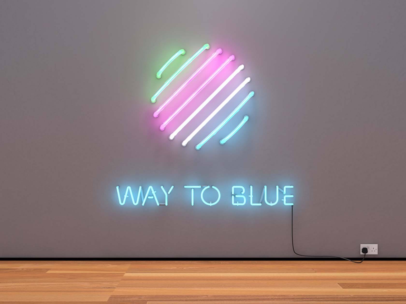
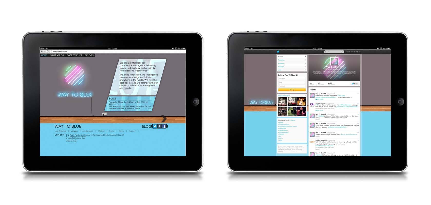
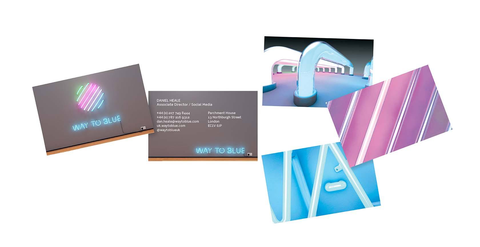
A global communications agency that never switches off needed an identity that does exactly that. Way To Blue sought a modern ‘badge of honour’ to reflect their four disciplines in a contemporary, vibrant way. It would also need to transfer across PR, film and digital.
STRATEGY
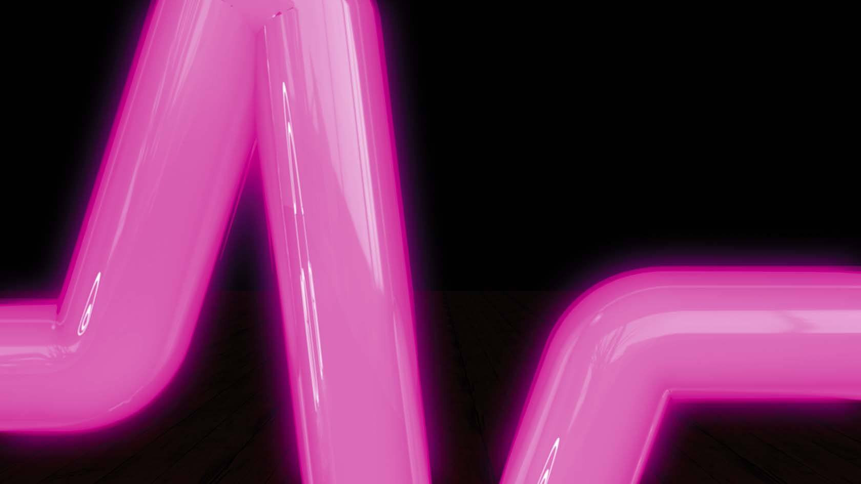
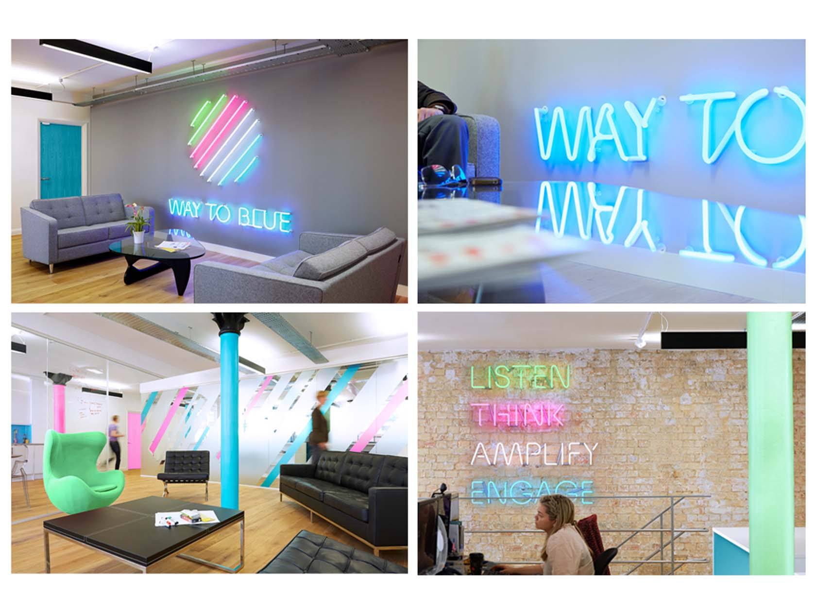
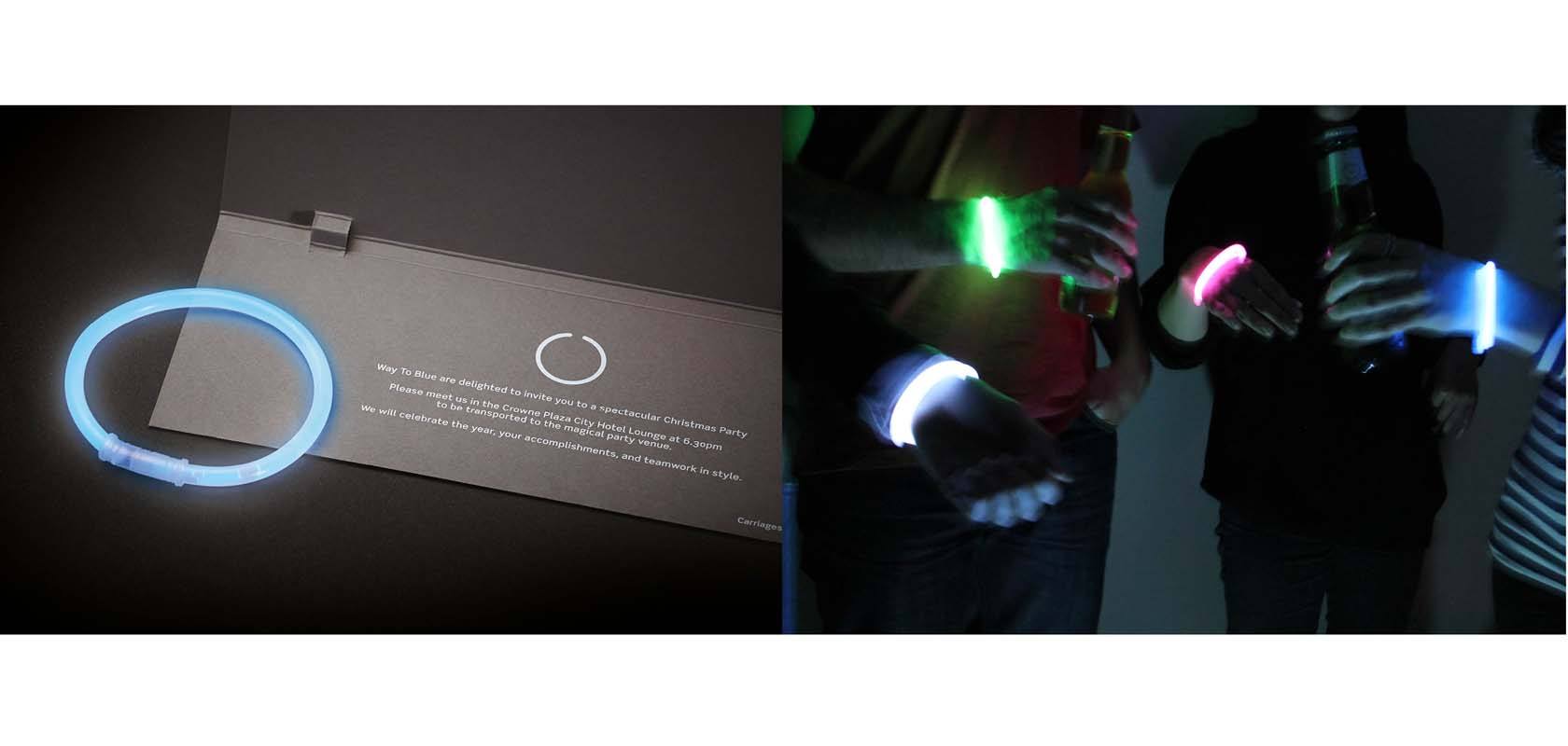
Following the successful rebrand, WMH created a showreel to explain their integrated approach. With ‘Switched on’ as the strategy, we built a 3D neon world within the walls of the agency.
SOLUTION
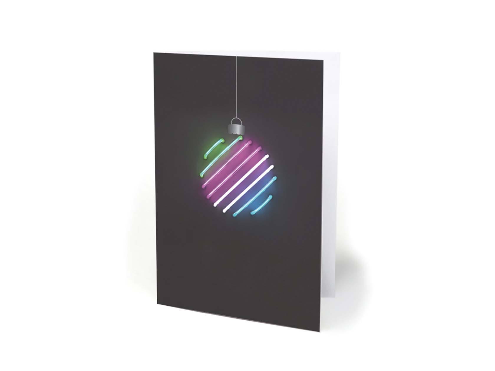
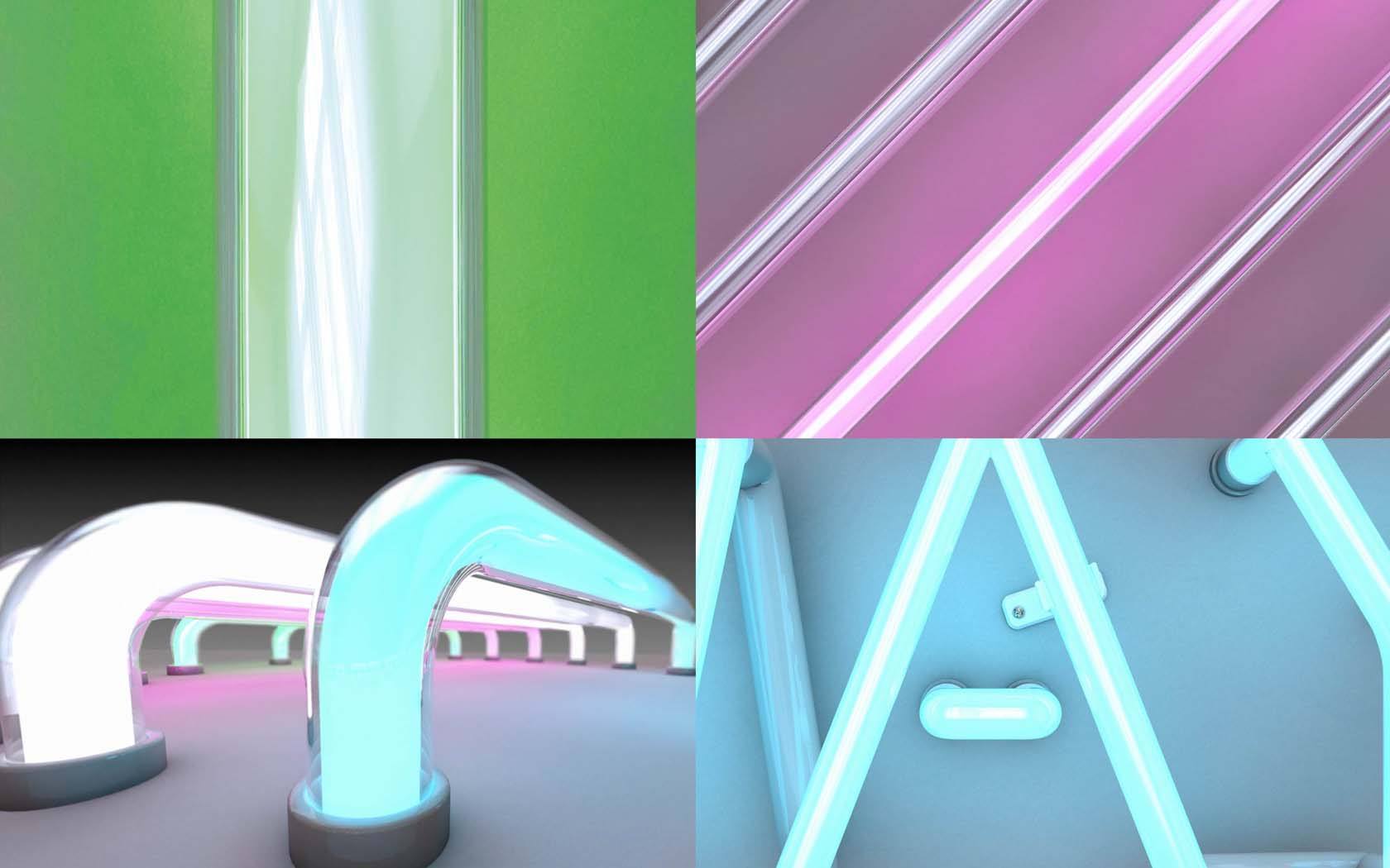
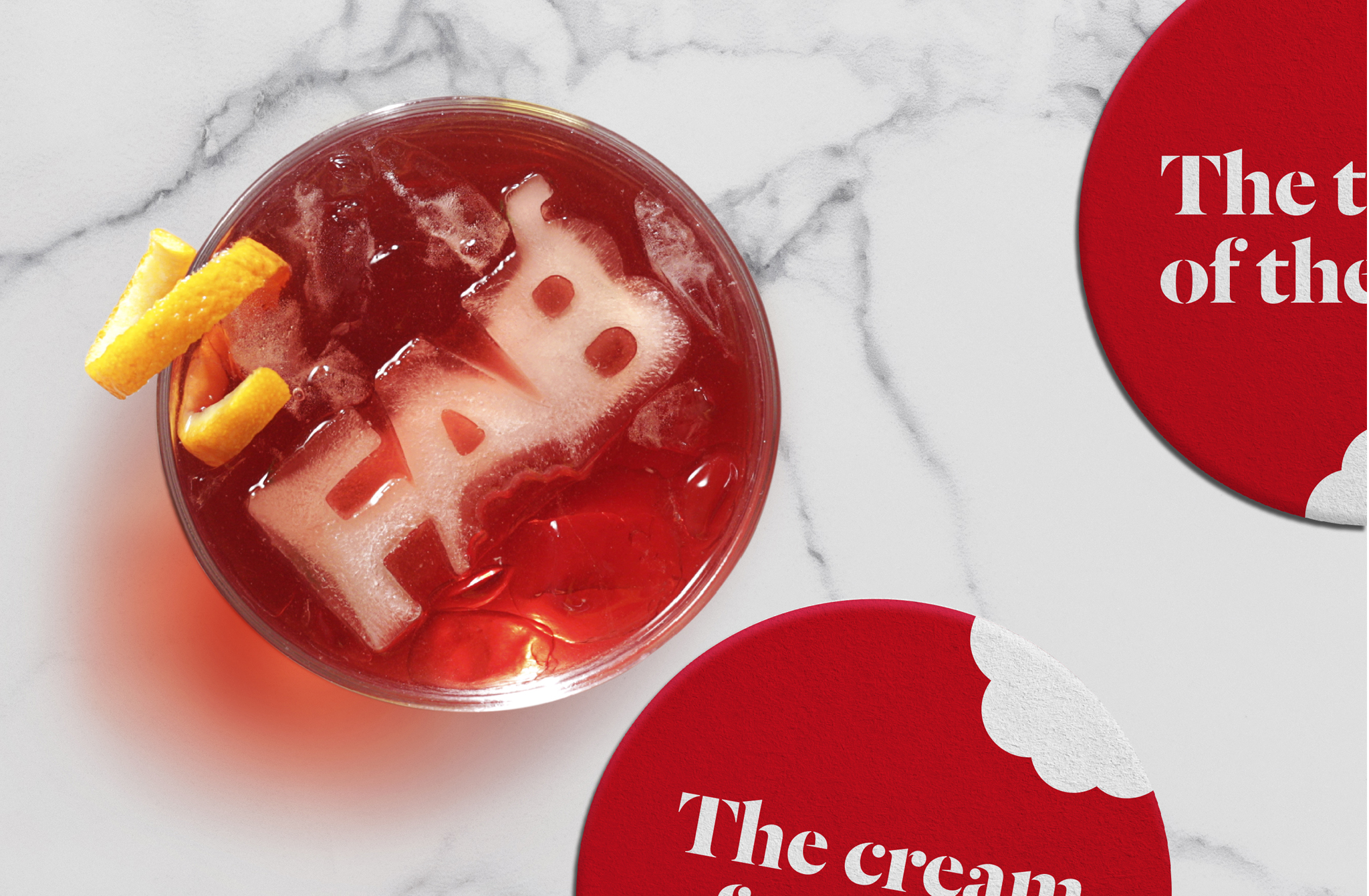
Giant flashing neon icons tell Way to Blue’s story and bring their four pillars, Listen, Think, Amplify and Engage, to vibrant life, illuminating the backbone to the company’s unique ‘switched on’ approach.