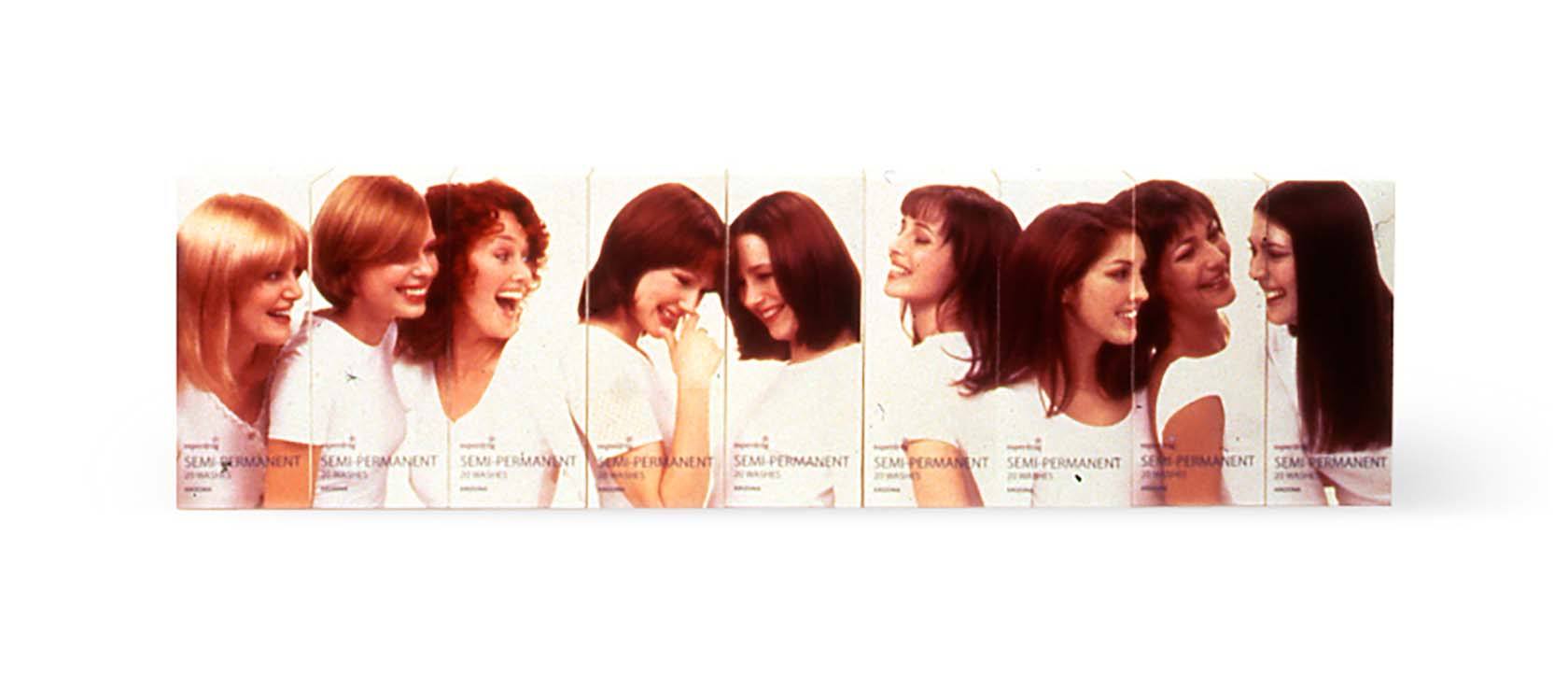
Superdrug
Making the serious friendly, cheerful and delightful.
BACKGROUND
Superdrug enjoyed a renaissance in the late 1990s. They redesigned their outlets and, driven by an appetite to be more creative and draw in a younger audience with more disposable income, asked us to redesign their more challenging product lines.
STRATEGY
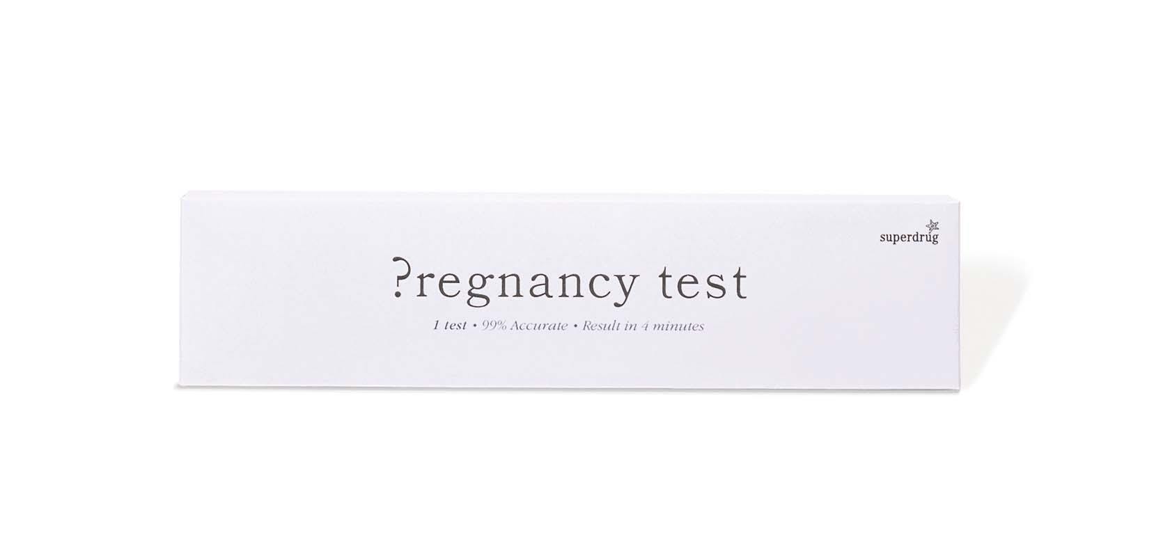
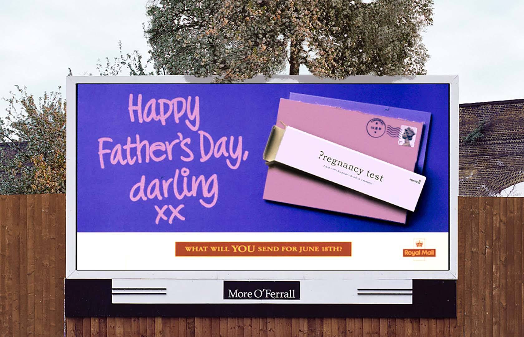
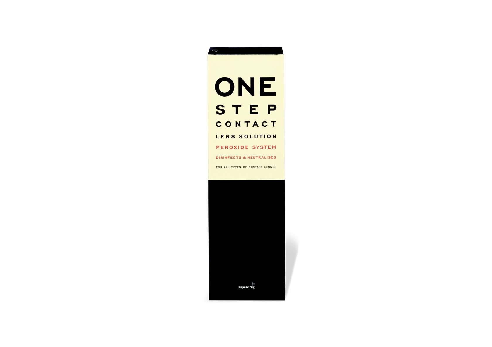
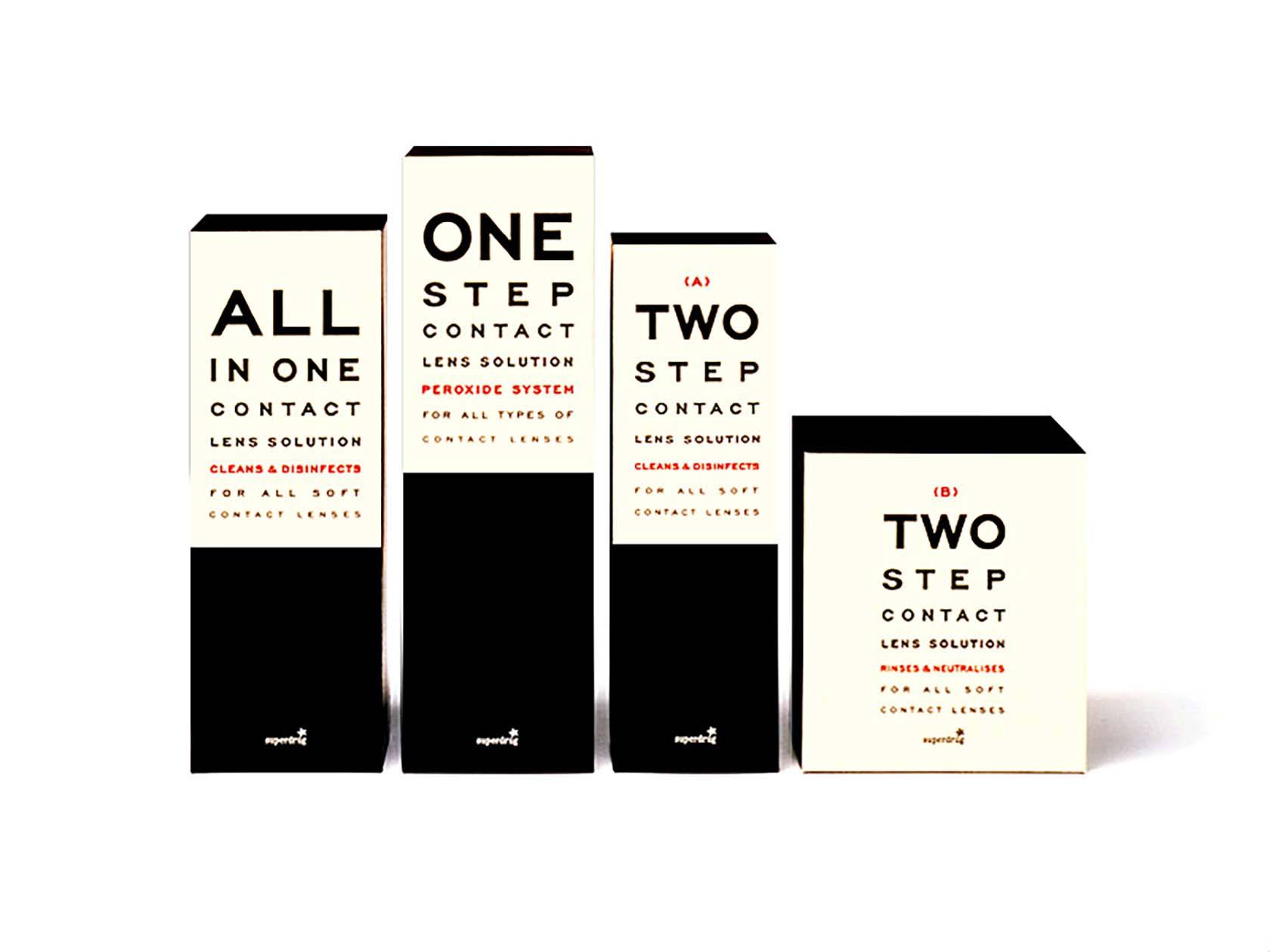
In an effort to differentiate themselves from Boots, Superdrug defined itself as ‘Young, Fun and Friendly’. This strategy posed problems when applied to products like pregnancy testing kits and eye care, which are more serious than shampoos and bubble bath.
SOLUTION
Witty design and clever, lighthearted copy worked well together across different product ranges. The pregnancy test became the ultimate question. For contact lens solution, we borrowed the language of the eye test. Our beautifully simple, type-led approach sold more products than the combined sales of the manufacturer brands Superdrug offered.