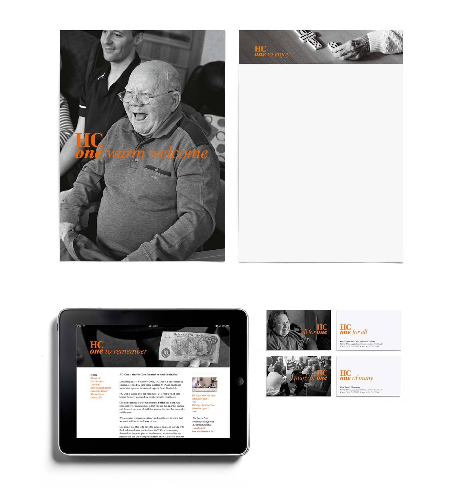
HC-One
Expressing the unique sense of ‘kindness’ in care homes.

BACKGROUND
HC-One was a new company, formed to take over the running of 241 care homes across the UK, formerly run by Southern Cross, who had very publicly gone into administration.
STRATEGY
Southern Cross’s financial turmoil and subsequent collapse had hit the headlines for all the wrong reasons, consequently WMH’s strategy was to focus HC-One around care for the individual, rather than profit. ‘Kindness’ became the watchword for the business.
SOLUTION
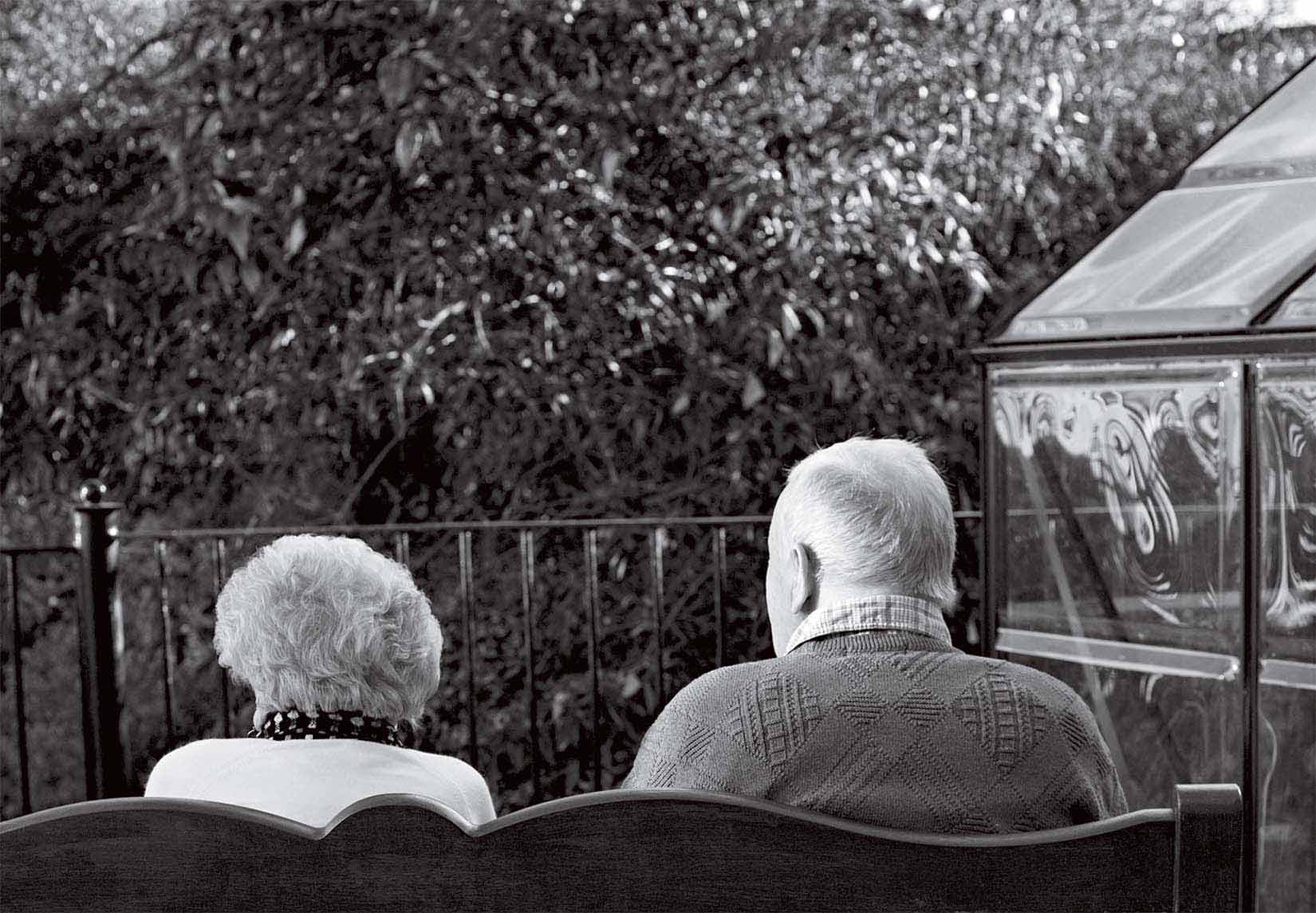
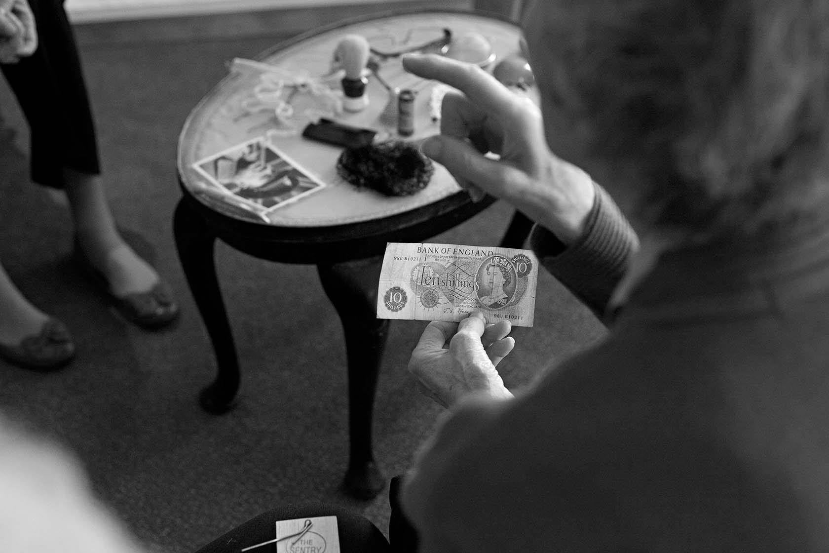
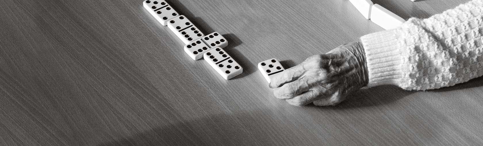
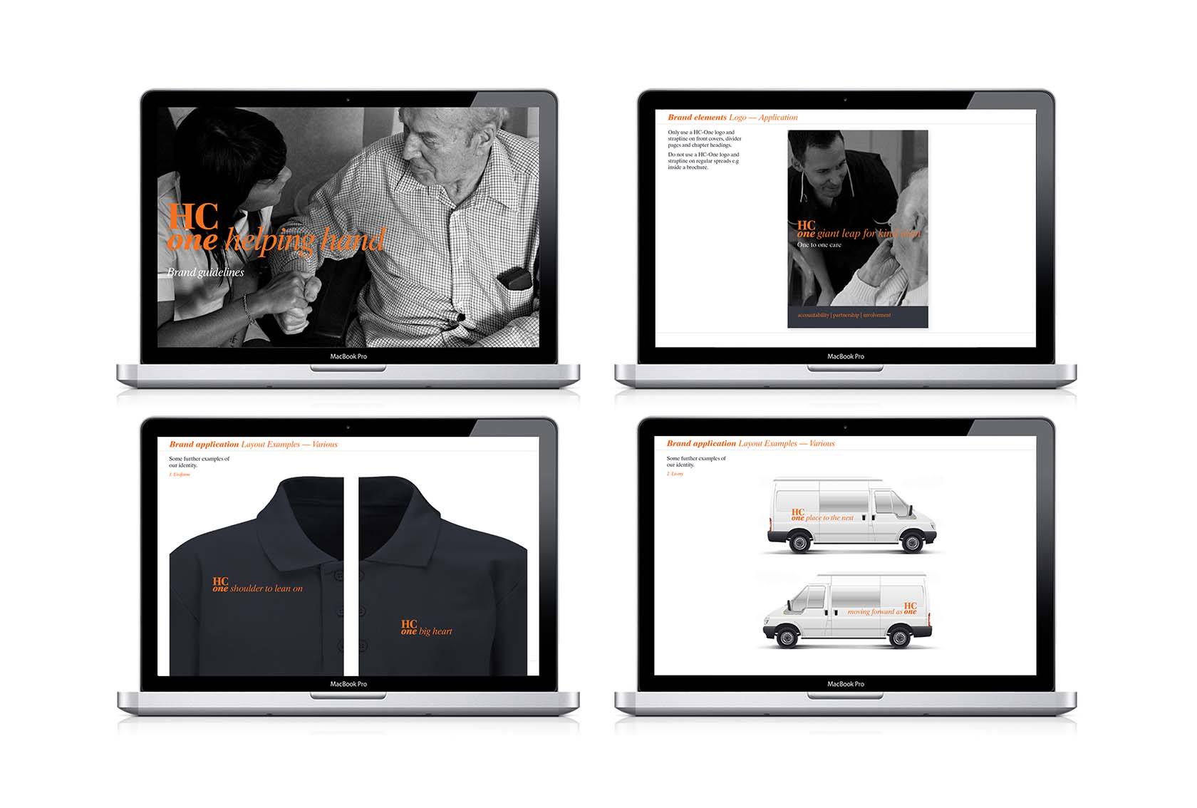
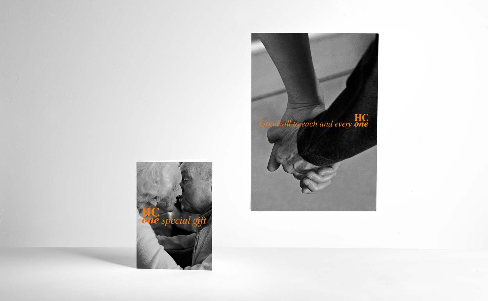
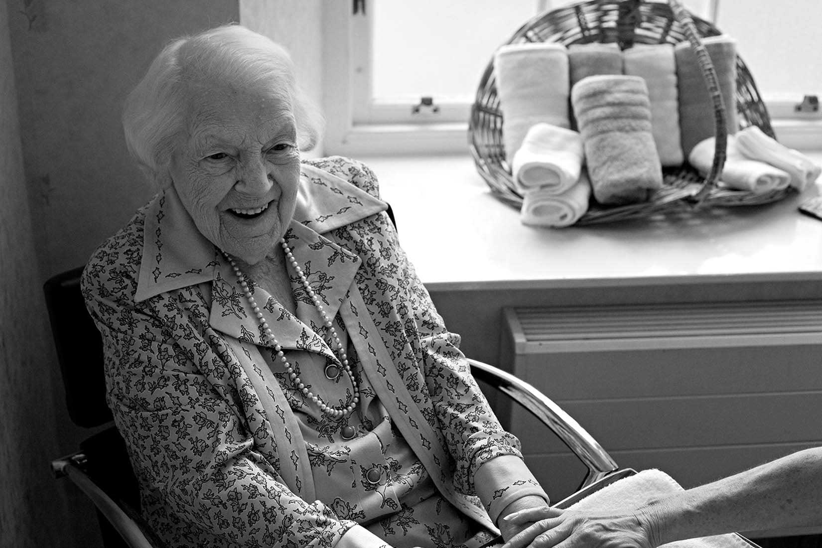
WMH’s identity uses unposed photography of real residents and staff, in simple black and white to give an honest picture of what life is really like for an HC-One resident. ‘One’ is used as the stepping off point for simple statements about the business – ‘One warm welcome’, ‘One great story’, ‘One shared purpose’.
More like this