LOVE / HATE: Amazon Fresh and the ‘First Moment of Truth’

‘Is it curtains for design agency claptrap?’ 

Following the recent UK launch of Amazon Fresh, Richard Williams and Garrick Hamm explore the Love and Hate of the brand packaging ‘First Moment of Truth’ in the digital age on online grocery shopping.
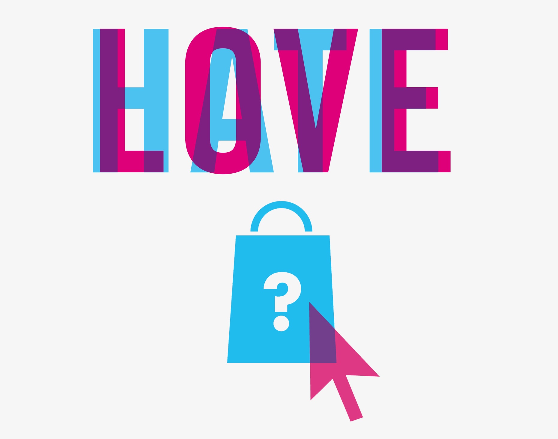
LOVE_HATE_AMAZON_FRESH_JUNE_DUEL_WEBSITE

Hate: Packaging

WMH-RICHARD-WILLIAMS-PROFILE-WEB

Many years ago, Procter and Gamble came up with the idea of ‘The First Moment of Truth’.

This was all about how packaging works in the supermarket and how first impressions really count. I can’t remember what the second and third moments of truth were, something about bar codes probably.

I wonder what P&G thinks about the FMOT of their brands as they appear in online shopping. Does it bring on an FMOH (First Moment of Horror)? Here’s the truth. Brands look dreadful on Ocado and as we’re about to be invaded by Amazon Fresh they need to do something now.

Since it’s only partially available in the UK, I had to pretend to live in the Empire State Building (ZIP code 10118) to be able to access it. What is glaringly obvious is that, if Amazon Fresh really takes off, (the British Retail Consortium predicts that 900,000 jobs will be lost by 2025 as the industry moves online) the claptrap and mumbo jumbo that packaging design agencies have peddled for years, in an effort to cover up their lack of creativity, will have no further use.

Amazon-Fresh-launch-WMH-Love-Hate

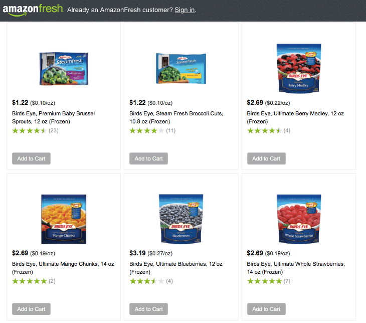
There is no ‘shelf blocking’ since there aren’t any shelves to block and you can’t see any ‘category cues’ or ‘appetite appeal’ because the pack shots are so tiny, the copy is illegible and everything is low res. The game’s up. Brands have to find a new way to work for online shopping and it’s a wonderful, thrilling opportunity.


Love: Smiles 

WMH-GARRICK-HAMM-PROFILE-WEB

Hopefully Amazon Fresh really will lead to a completely different way of presenting brands on screen.  They’re going to have to look at simple visual mnemonics. It could even lead to a new golden era where intelligent, meaningful logos represent a brand instead of dull old packaging.

Actually, this is really just a gratuitous excuse to talk about the recently updated ‘A Smile in the Mind’. Along with Alan Fletcher’s ‘The Art of Looking Sideways’ it is one of the must-have books on engaging, intelligent design. I’ve always loved those clever little logos that give a business personality.

The original Spratt’s pet food logo is clunky and artless, but incredibly endearing. Dog happiness is built right into it. I also came across this little beauty for Knapp Shoes (obviously) by Chermayeff & Geismar Inc. in New York. It’s a lovely witty mark. Simple and clever. How could you resist? Similarly, Norbert Dutton’s 1959 logo for electronics business, Plessey, is something we’d be proud to have done today.

Plessey-spratts-knapp-shoes-logos-WMH-Love-Hate-THREE

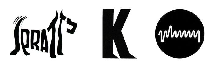
(left) Spratts – Logo designed by Max Field-Bush (UK). Copyright (second extension) 2016, Julien Clairet of DATA ACCESS Paris. / (middle) Knapp Shoes – Logo designed by Charmayeff & Geismar Inc. / (right) The Plessey Company Ltd – Logo designed by Norbert Dutton’s 1959


With wit like this, think what you could do for a brand like Bird’s Eye or Flash. We won’t see the end of supermarket packaging by any means and I fear that we won’t lose steamy shots of soup and stringy cheese slices on pizza packs, but perhaps Amazon Fresh, unwittingly, will lead to a design revolution where we go back to intelligent, beautifully thought through brand identities.

I can’t wait.


Authors: Richard Williams & Garrick Hamm. 

For any press enquiries email press@wmhagency.com or call +44 (0) 20 3217 0000.

Unless otherwise cited, © copyright 2016 Williams Murray Hamm, all rights reserved.

WMH wins GOLD for JuiceBurst at the DBA Design Effectiveness Awards 2016

Williams Murray Hamm, with client Purity Soft Drinks, won gold for Brand Design with its groundbreaking work on JuiceBurst, at this year’s Design Effectiveness Awards.

DEA2016 gold WMH JuiceBurst stageshot

Recognised as one of the UK’s most prestigious design for business awards, Thursday night’s annual turnout was held at Tobacco Dock, London. The guest list of shortlisted winners included many of the top 20 creative and design businesses in this country.

Judged by business leaders and entered jointly by client and designer, the DBA Design Effectiveness Awards are both rigorous and authoritative. They celebrate the power of design to drive business success and provide compelling proof of why design is a sound commercial investment.

Popular with small, independent retailers, JuiceBurst was missing a massive opportunity by having no presence amongst large convenience retailers like WHSmith. In order to achieve significant retail listings to drive growth, WMH defined a target audience, positioned the brand and created highly differentiated packaging that would really engage consumers.

WMH, JUICEBURST, CONSUMERS, PURITY SOFT DRINKS, DE2016 AWARD, DBA

Building on the brand’s name, WMH used fruit being detonated as the central motif. This overarching idea connected the packaging to social media and digital content via Blippar, the augmented reality app.

JuiceBurst WMH Blippar DEA2016 DBA

Since re-launch, JuiceBurst has become one of the nation’s fastest growing beverage brands. In a market declining by -9%, it is growing at 93% year on year. There has been an amazing 75% annual profit increase and distribution has increased from one to nine national retailers.

WMH Creative Director Garrick Hamm said ‘It just illustrates, again, that great, simple creative ideas can make a difference to the bottom line. I’m delighted for our long-standing and supportive client Jon Evans at Purity and, of course, our hard working team at WMH’.

WMH, DBA, DEA2016, group photo, juiceburst

For press enquiries contact press@wmhagency.com or call +44 (0) 20 3217 0000.

(All images copyright of Williams Murray Hamm 2016, all rights reserved) 


Set to Burst

APPLE-BLUEBERRY2

We’ve always had a strong portfolio of ambitious small brands that can’t afford large ad budgets. They tend to see their packaging as media they own and come to us because we create campaignable ideas that they can make noise with.

Purity Soft Drinks is typical of this kind of client. They have huge ambitions for their JuiceBurst brand, which is loved by newsagents across the land, but so completely anonymous that few consumers would recognise it.

We were hired, initially, to develop the brand strategy and packaging, but the work has taken us much further and into the realms of film-making, SFX and augmented reality.

JuiceBurst looked like an own label product in a clunky bottle. The only way we could make it behave like a brand was create an identity based on the one thing it could own – the best juice on the shelf having a bit of an outburst. The idea’s in the name.

Because we’re such an ideas driven business, people don’t realise that we love designing pack structures. In this case we created a big fat, juicy shape that glugs effortlessly – JuiceBurst is a big drink.

All along, it was clear that we could do so much more with the brand than redesign it. Squeezing the pips of the marketing budget (we just had to get that in) we worked with Artem, the firm behind many of the special effects of the Olympics ceremonies. They became expert at detonating fruit while Matt Broad caught it all on high speed, HD film. Lisa Desforges wrote the witty outbursts and Frank Pescod did his magic on the musical front.

The result is a range of films with beautiful, real fruit bursting in all their glory. A still of the film is used on each label and you can watch a short documentary film of how we did it, a must see. How could you resist watching grown men blow up fruit? It’ll be as big as ‘Buttrocket’, only messier. See the making-of film here.

Blippar™ is a phone app that recognises features of a label, or newspaper and brings it to life. In the case of JuiceBurst, you point your smartphone at the label and you’re presented with interactive graphics that turn with the bottle and offer you games, win prizes or let you watch the ‘How We Made JuiceBurst’ short film.

Working closely with the guys at Blippar, we’re proud to present the first ever augmented-reality enabled soft drinks packaging. See all the fruit bursting films here.

Eng day

This is the gallery of Exploding fruit.

VIEW ON FACEBOOK