Lamb Weston Innovation Centre

WILLIAMS MURRAY HAMM DESIGNS STATE OF THE ART INNOVATION CENTRE FOR LAMB WESTON.

WMH-LAMBWESTON-INNOVATION-CENTRE-DREAM-WALL-1680WEB

Following the creation of a new brand purpose and visual identity for Lamb Weston’s global business, WMH was asked to design the interior of an innovation centre where possibilities become reality. 

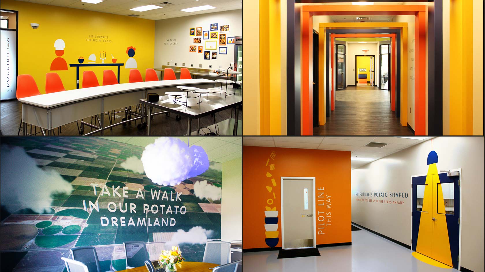
Lamb Weston, a ConAgra Foods brand, has more than 60 years’ experience as one of the world’s leading suppliers of frozen potato products to restaurants and consumers. An industry pioneer, the company planned a new, state of the art, innovation centre with co-creation spaces, fully functioning kitchens, pilot line, interactive areas and a resource for employees; in short a place where possibilities could become reality.

Having already started the building phase for the project, Lamb Weston approached long time collaborating agency WMH in March 2016 to create the overall theme and interiors. The Centre opened to employees on 24 June and to Lamb Weston customers soon after.

WMH-LAMBWESTON-INNOVATION-CENTRE-QUAD-SHOT-1-1680WEB

WMH had previously helped Lamb Weston relaunch its new global positioning and identity: to be the most inventive potato company in the world. The Innovation Centre would express this purpose and help find new, more inventive ways of collaboration between customers and Lamb Weston staff.

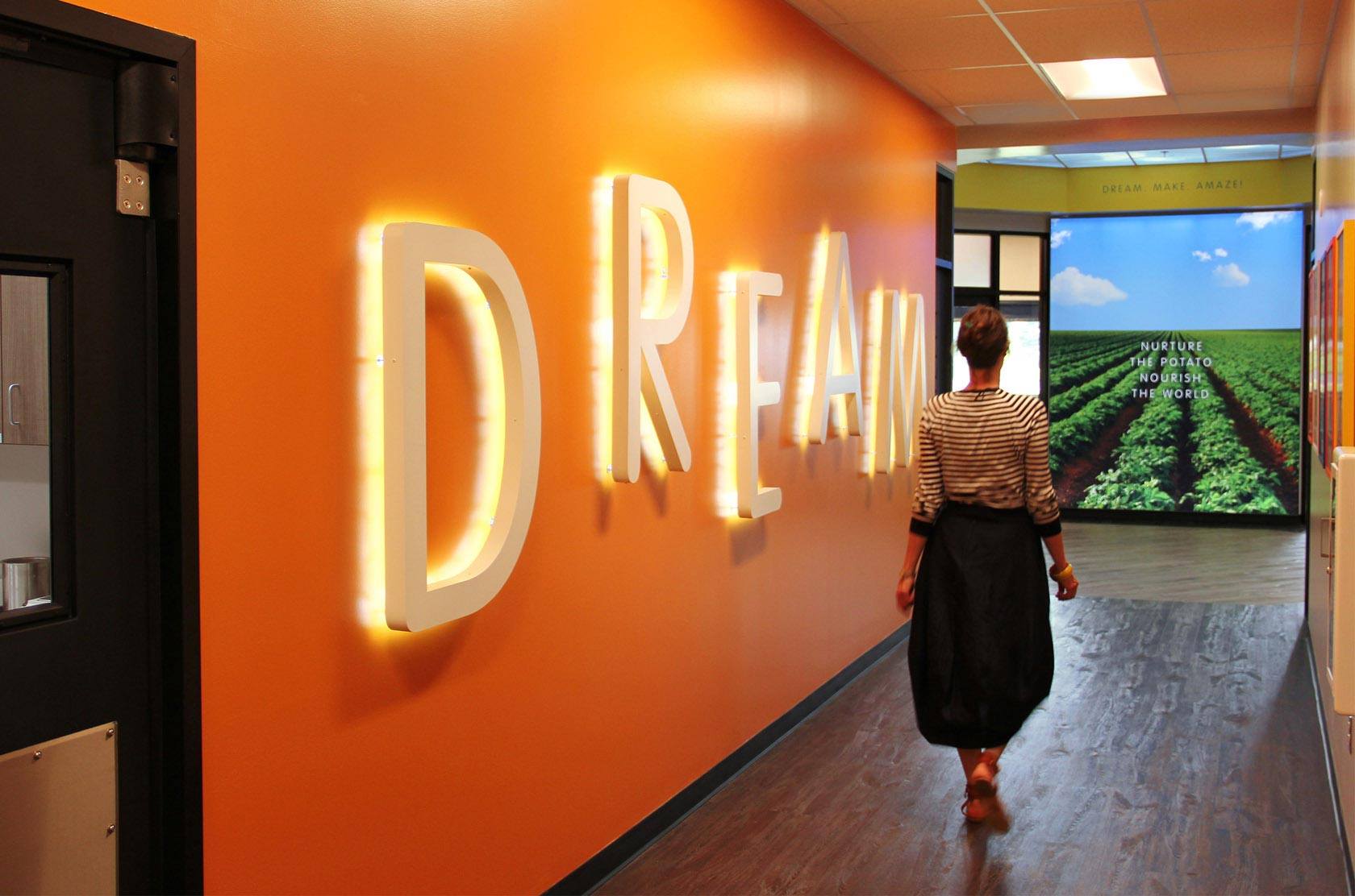
Intended as a flagship Lamb Weston US building, the Innovation Centre needed to be a place that captured the imagination and be worthy of the claim ‘if you dream it, you can make it here’.

Deborah L. Dihel, Ph.D. Senior Director Research and Innovation at Lamb Weston said:

“Our new Innovation Centre is absolutely incredible. WMH was the perfect partner to help us communicate Lamb Weston’s brand promise throughout the building in a distinctive and memorable way. The design elements set the stage as soon as our visitors see us from the street, and their experiences are enhanced further as they enter and work in the space. WMH’s design communicates our history of successful innovation, yet at the same time, inspires all who enter to be futuristic, be inventive and make their potato dreams a reality.”

WMH-LAMBWESTON-INNOVATION-CENTRE-QUAD-SHOT-2-1680WEB

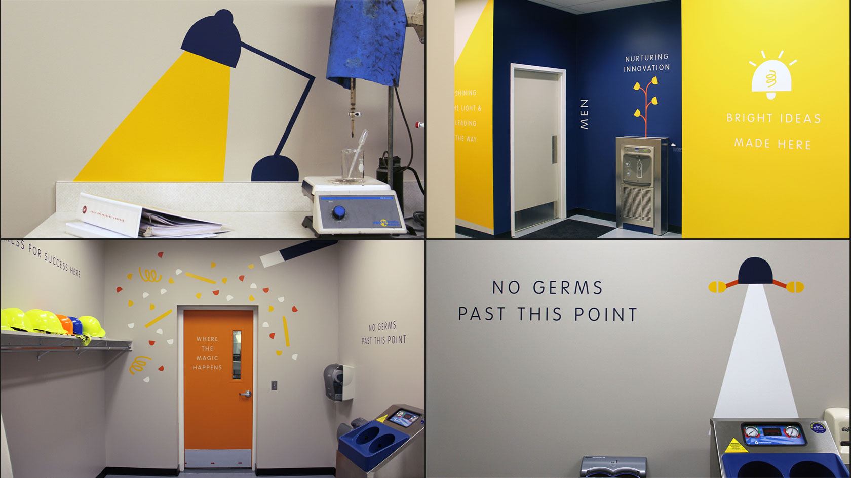
Using the playful design it had created for the brand identity, WMH produced a fully sensory experience for the many spaces in the Centre.  Bright and light, visitors encounter witty and striking wall graphics at every turn. Interactive areas have been created to bring to life the history of the business, its vision and values and to relate employee stories.  Breakout rooms inspire new and innovative ways of working together.

On the experience, Garrick Hamm, Creative Director of Williams Murray Hamm said:

“We love working with Lamb Weston.  Once again, WMH has been there to help them bring their Innovation Centre to life.  Their strength of purpose, reflected in the Innovation Centre design, really encourages their employees and customers to be as inventive and imaginative as they like – the possibilities are endless”.

The Innovation Centre launched on 24 June.


For any press enquiries email press@wmhagency.com  or call +44 (0) 20 3217 0000.
Unless otherwise cited, © copyright 2016 Williams Murray Hamm, all rights reserved.

LOVE / HATE: Amazon Fresh and the ‘First Moment of Truth’

‘Is it curtains for design agency claptrap?’ 

Following the recent UK launch of Amazon Fresh, Richard Williams and Garrick Hamm explore the Love and Hate of the brand packaging ‘First Moment of Truth’ in the digital age on online grocery shopping.

LOVE_HATE_AMAZON_FRESH_JUNE_DUEL_WEBSITE

Hate: Packaging

WMH-RICHARD-WILLIAMS-PROFILE-WEB

Many years ago, Procter and Gamble came up with the idea of ‘The First Moment of Truth’.

This was all about how packaging works in the supermarket and how first impressions really count. I can’t remember what the second and third moments of truth were, something about bar codes probably.

I wonder what P&G thinks about the FMOT of their brands as they appear in online shopping. Does it bring on an FMOH (First Moment of Horror)? Here’s the truth. Brands look dreadful on Ocado and as we’re about to be invaded by Amazon Fresh they need to do something now.

Since it’s only partially available in the UK, I had to pretend to live in the Empire State Building (ZIP code 10118) to be able to access it. What is glaringly obvious is that, if Amazon Fresh really takes off, (the British Retail Consortium predicts that 900,000 jobs will be lost by 2025 as the industry moves online) the claptrap and mumbo jumbo that packaging design agencies have peddled for years, in an effort to cover up their lack of creativity, will have no further use.

Amazon-Fresh-launch-WMH-Love-Hate

There is no ‘shelf blocking’ since there aren’t any shelves to block and you can’t see any ‘category cues’ or ‘appetite appeal’ because the pack shots are so tiny, the copy is illegible and everything is low res. The game’s up. Brands have to find a new way to work for online shopping and it’s a wonderful, thrilling opportunity.


Love: Smiles 

WMH-GARRICK-HAMM-PROFILE-WEB

Hopefully Amazon Fresh really will lead to a completely different way of presenting brands on screen.  They’re going to have to look at simple visual mnemonics. It could even lead to a new golden era where intelligent, meaningful logos represent a brand instead of dull old packaging.

Actually, this is really just a gratuitous excuse to talk about the recently updated ‘A Smile in the Mind’. Along with Alan Fletcher’s ‘The Art of Looking Sideways’ it is one of the must-have books on engaging, intelligent design. I’ve always loved those clever little logos that give a business personality.

The original Spratt’s pet food logo is clunky and artless, but incredibly endearing. Dog happiness is built right into it. I also came across this little beauty for Knapp Shoes (obviously) by Chermayeff & Geismar Inc. in New York. It’s a lovely witty mark. Simple and clever. How could you resist? Similarly, Norbert Dutton’s 1959 logo for electronics business, Plessey, is something we’d be proud to have done today.

Plessey-spratts-knapp-shoes-logos-WMH-Love-Hate-THREE

(left) Spratts – Logo designed by Max Field-Bush (UK). Copyright (second extension) 2016, Julien Clairet of DATA ACCESS Paris. / (middle) Knapp Shoes – Logo designed by Charmayeff & Geismar Inc. / (right) The Plessey Company Ltd – Logo designed by Norbert Dutton’s 1959


With wit like this, think what you could do for a brand like Bird’s Eye or Flash. We won’t see the end of supermarket packaging by any means and I fear that we won’t lose steamy shots of soup and stringy cheese slices on pizza packs, but perhaps Amazon Fresh, unwittingly, will lead to a design revolution where we go back to intelligent, beautifully thought through brand identities.

I can’t wait.


Authors: Richard Williams & Garrick Hamm. 

For any press enquiries email press@wmhagency.com or call +44 (0) 20 3217 0000.

Unless otherwise cited, © copyright 2016 Williams Murray Hamm, all rights reserved.