


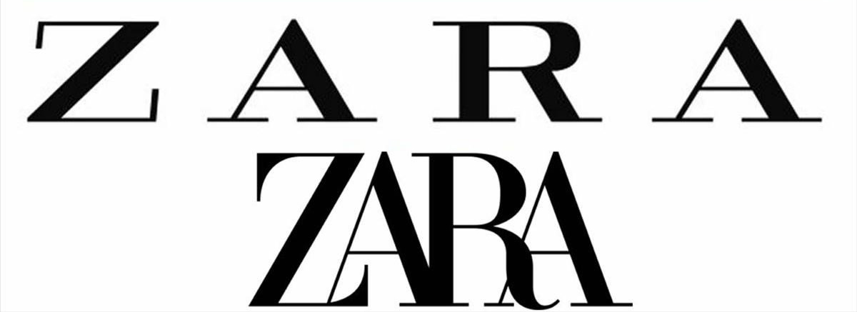
Zara’s new logo is proving controversial. ‘Claustrophobic’ and ‘pointless’ are just two of the criticisms levelled at it by fans on Twitter, thus fuelling media headlines. But people are getting hung up about logos without trying to understand the broader picture.
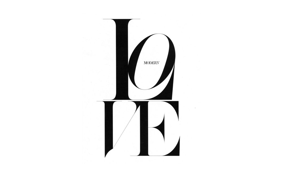
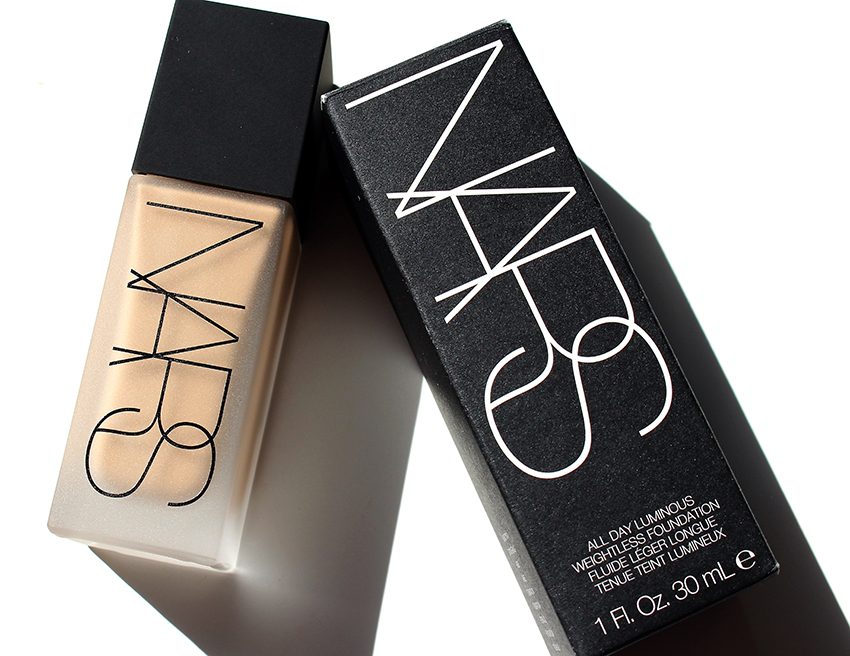 Aesthetically, the new mark bears similarities to Zara’s previous one, launched in 2011. Both comprise four capitalised letters of the brand’s name in a serif font. The new one differs by squashing the letters together which, to some, makes it feel tangled and hard to read. A typographic approach reminiscent of iconic (and much loved) French cosmetic brand NARS.
It has been criticised, too, for being ill-considered for digital platforms and poorly drawn. It is, however, a move away from what Fast Company recently called one of the biggest design trends of 2018: sans-serif logos with too much white space between the letters – a style that’s now so ubiquitous it’s become almost generic.
Some have suggested Zara’s new logo is an indication of the brand seeking to claim its place among the visual style of older, more established world brands. By bucking the trend, Zara’s new design may help it stand out.
Masters of premium mediocracy
Back in 2017, writer and consultant Venkatesh Rao coined the phrase ‘premium mediocre’. He was referring to the product development tactic of giving mass market consumers the illusion that they are consuming luxury when they are not. McDonald’s Signature Burger Collection is a prime example. It’s all about providing an air of exclusivity without excluding anyone, much like the concept, and my pet hate, of ‘affordable luxury’. From Tommy Hilfiger watches to Balenciaga baseball hats and Gucci headbands, this has become ubiquitous in fashion.
The masters of premium mediocre fashion often come from the United States. Brands like Michael Kors and Kate Spade have mastered the art of selling an averagely made bag with enough superficial touches to give the appearance of a premium product. It is often the small accessory items that work particularly well here in selling consumers a little piece of affordable luxury. Buying into the illusion makes us feel good for a moment and we are increasingly receptive. According to Euromonitor, small leather luxury goods are expected to grow to $7.5bn for 2020, from $5.7bn in 2015.
Look beyond the logo
 Back to Zara and the designer of its new logo; Fabien Baron. Baron is an art director well-known for iconic ad campaigns; designing Madonna’s 1992 Sex book along with product and packaging for CK One; being creative director for Harper’s Bazaar and reinventing Italian Vogue in the late 1980s. He has been instrumental in the look of fashion since the 1990. As it happens, he has also worked with many of the premium mediocre brands like Calvin Klein, Ralph Lauren and Michael Kors. Zara is also an old client of his agency.
Whether Baron will have further involvement in Zara’s actual brand identity and is not yet clear. Might he set out the wider creative direction for the brand? In using Fabien Baron, Zara is trying to close the gap between its fast fashion proposition and premium mediocre brands such as Klein, Kors and Kane. At a time of growing online sales, this can only be a wise move. If a consumer can’t see or feel the physical difference between products, then to visually match or, even become better than your more expensive competitors can only be a good idea.
Author: Wybe Magermans – Managing Director
For any press enquiries email press@wmhagency.com or call +44 (0) 20 3217 0000.
Unless otherwise cited, © copyright 2019 Williams Murray Hamm, all rights reserved.