By Richard Williams July 2014
In October, I’m turning 65. When I’m stopped by a researcher at Heathrow, as I always am and asked what my age is, I’ll be in the last group: ‘65+’. I’m no longer very interesting. I’m not ‘youth’, nor up and coming, or even a regular business traveller anymore. I’m just, what a client recently referred to as a ‘Good-lifer’, a target for walk in baths and Michael Parkinson’s free biro if I buy a funeral plan. I’m 15 years into Saga already. It couldn’t be bleaker.
Unwittingly, I’ve also joined a list of consumers who have special needs. We’re so old that we can’t open packaging with the dexterity that others can and we can’t read said packaging without taking out our specs. I was asked recently by a very well meaning business, if WMH would be interested in helping them create packaging design rules for brands that are aimed at retired people and it was this question that prompted this blog.
Do older/retired people eat different brands to younger people anymore? We’ve all got our own teeth nowadays. I see little difference between my fridge and that of my 33 years old daughter and I see her struggle with reading and opening packaging rather more than I do.
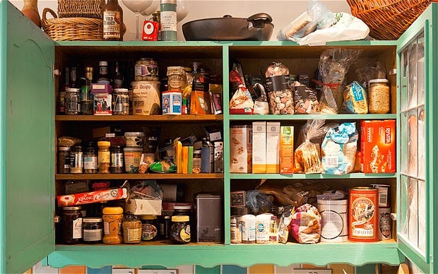
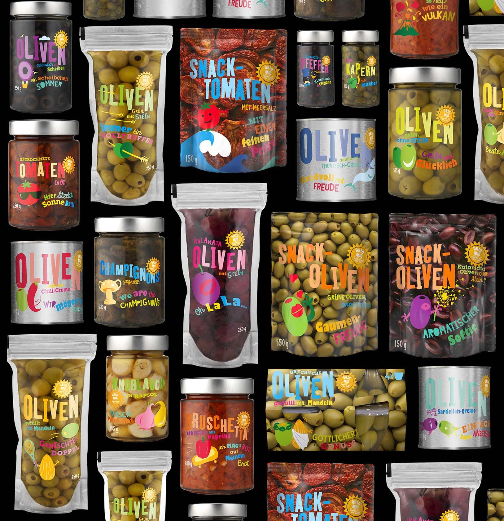
Whilst packaging does a very decent job of making the most of pallet space and supermarket shelf capacity and we have much to thank it for freshness, current packaging is generally dreadful. It is rife with stuff I don’t want, or need, to know and short on the things that really matter.
Some years ago we ran a project for a global foods business from the US, to help them explain what’s good about their products to consumers. Of course, our initial reaction was that convenience food was just old fashioned junk and irredeemably bad. Once we’d stopped being so up ourselves, it became very clear that millions of people around the world have a great need for convenience food. They don’t have the time nor the money to be scratch cooks, even if they’d like to. They’re getting by the best way they can. However, they all want to serve their family decent and healthy food that they can enjoy.
The odd thing is that food manufacturers forget to tell them things they want to know, like ‘What’s a preservative? What’s gum? Why are they in this product? How and where is it made and by whom?’ In most cases, the impression is that convenience food is made by accountants.
The things that matter to us, retired or not are mostly the same and we want to know more not less. It’s as though ‘back of pack’ should become ‘front of pack’. Tell us what we want and need to know and do it so we can all read it (spectacles are not the preserve of an aging population) and stop telling us things we already know or stuff we just don’t believe.
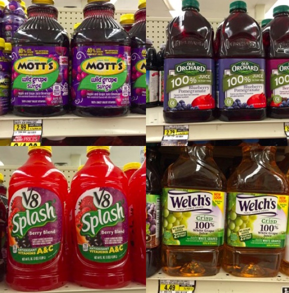
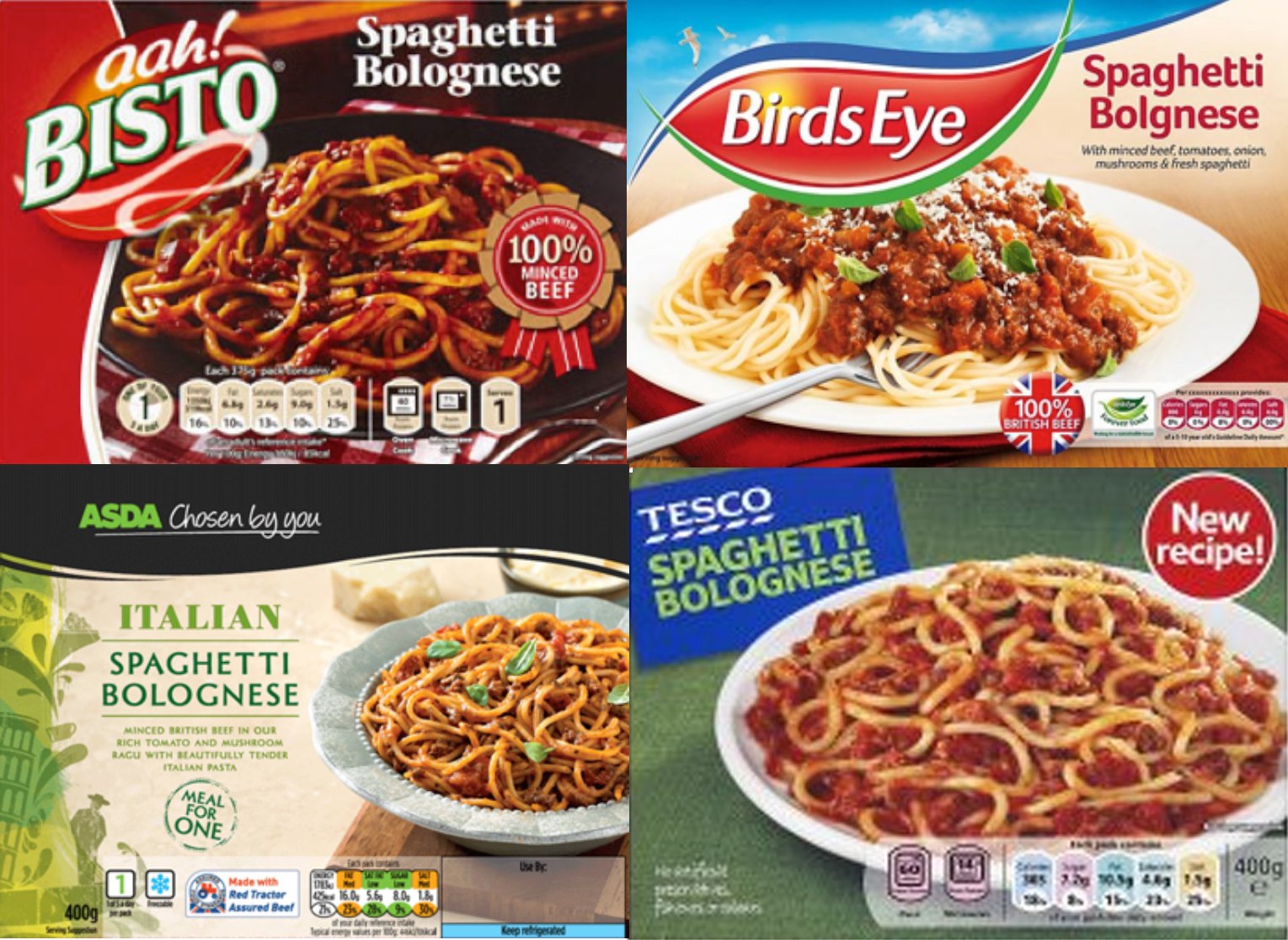
A typical example is the four Spaghetti Bolognese ready meals shown below. They all seem to have been flung together without a thought about what they are saying to people. Knowledge is sacrificed on the altar of logo and ‘appetite appeal’. I want to know, who made these products – who’s hand has been upon them? What do they contain and why? Why is Asda’s range called ‘Chosen by you” – what’s the story behind that?
It’s as meaningless as ‘Your M&S’ – no, it’s not my M&S, it belongs to a load of shareholders who wish M&S would focus on getting the product right rather than marketing Newspeak. In the case of the Spaghetti Bolognese, it’s pointless graphics that misses a great opportunity to talk about care in sourcing, decent ingredients and healthy consumption. We patronise the less well off by thinking they are drawn to big pictures of food with some steam on, or a bogus Italian scene.
Once we’ve bought it, manufacturers need to make sure that packaging is a pleasure to open and use. It’s an old chestnut, I know, but I was told recently that a client’s biggest innovation in the last twenty years was a re-sealable pack. Really? In the time that Dyson has reinvented the vacuum cleaner, you’ve come up with a pack that reseals?

How is it that yoghurt pots, milk cartons, sauce jars, toothpaste dispensers, razor blades, liquid soap, chocolate bars and many, many more products that have adorned our cupboards for the last century, remain beastly to open and use for everyone? They are made in the cheapest possible way to run down the line, be stacked and sold with scant consideration for the end user. Again, having trouble opening a pack is not the preserve of older consumers, it is a nuisance to anyone who buys and uses products every day.


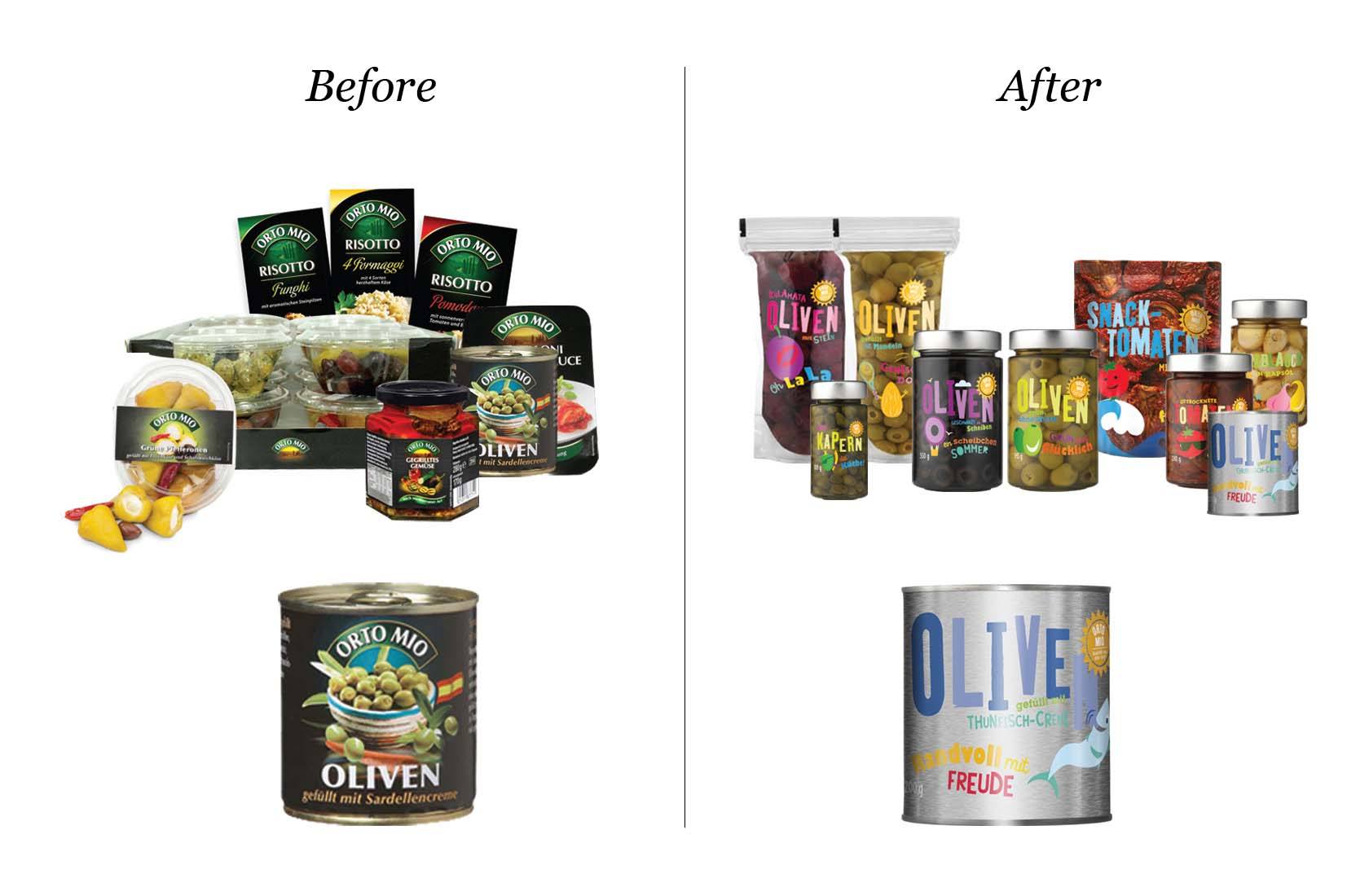

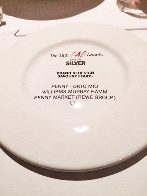
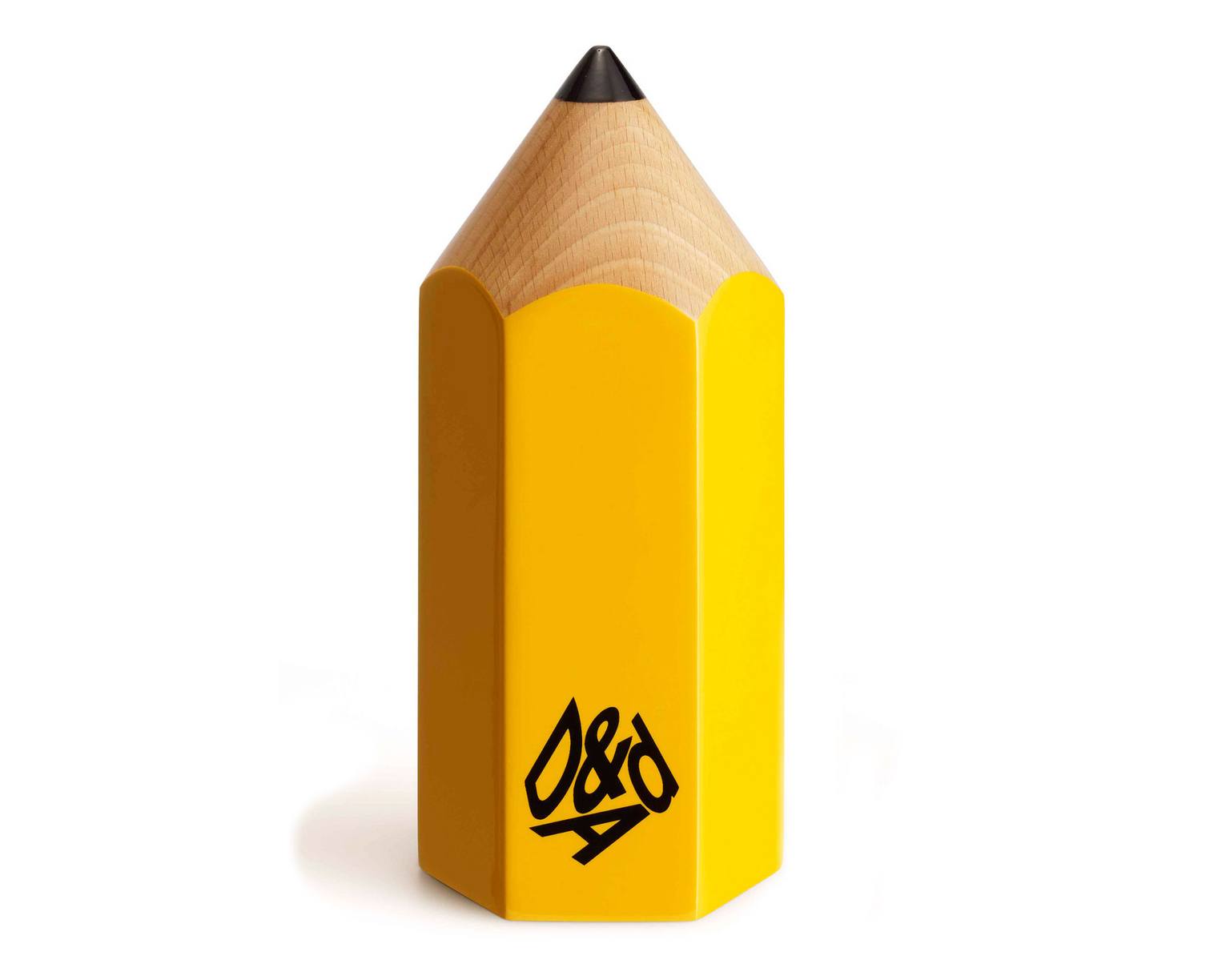 Tonight, WMH was awarded a coveted
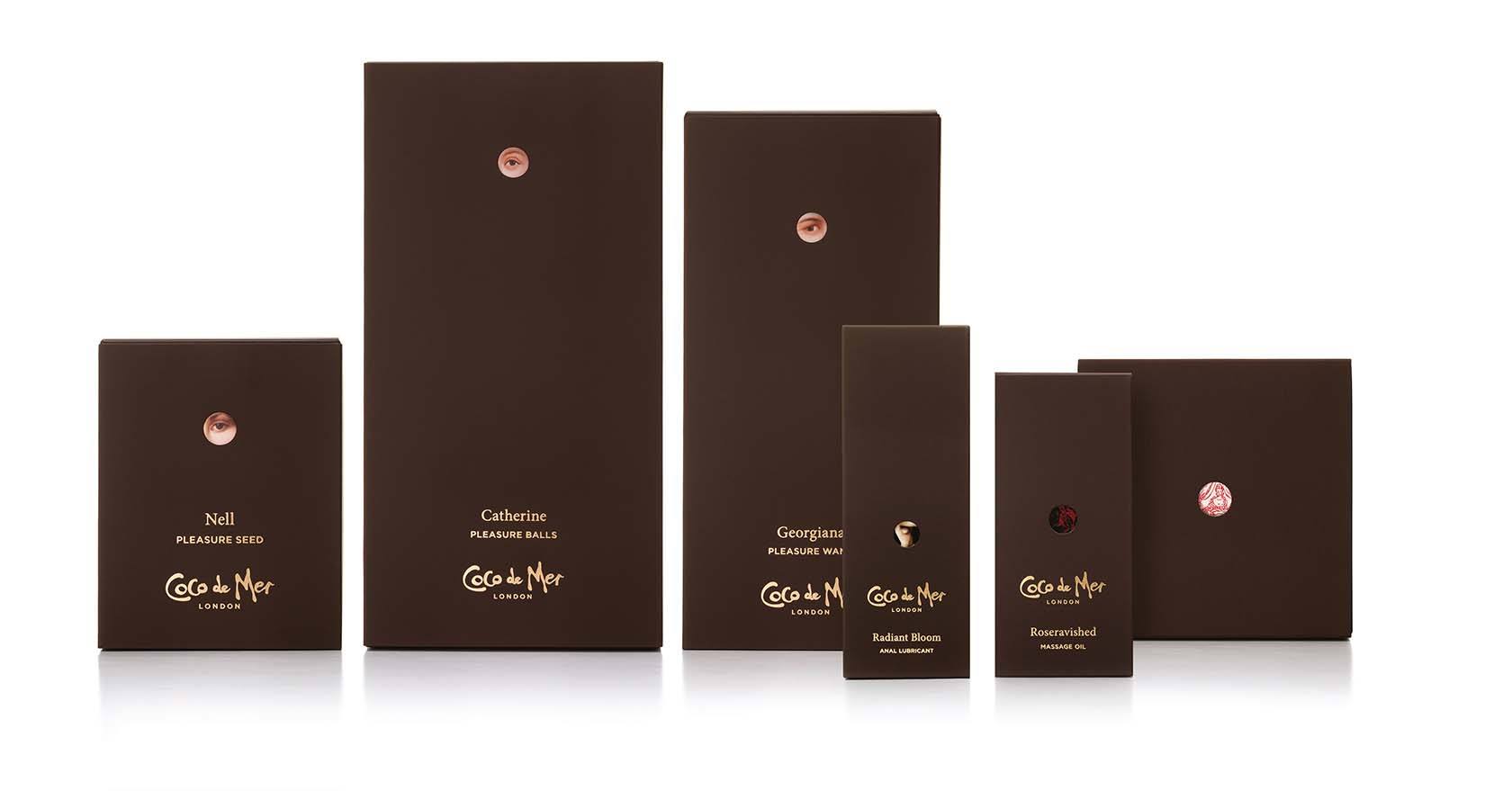
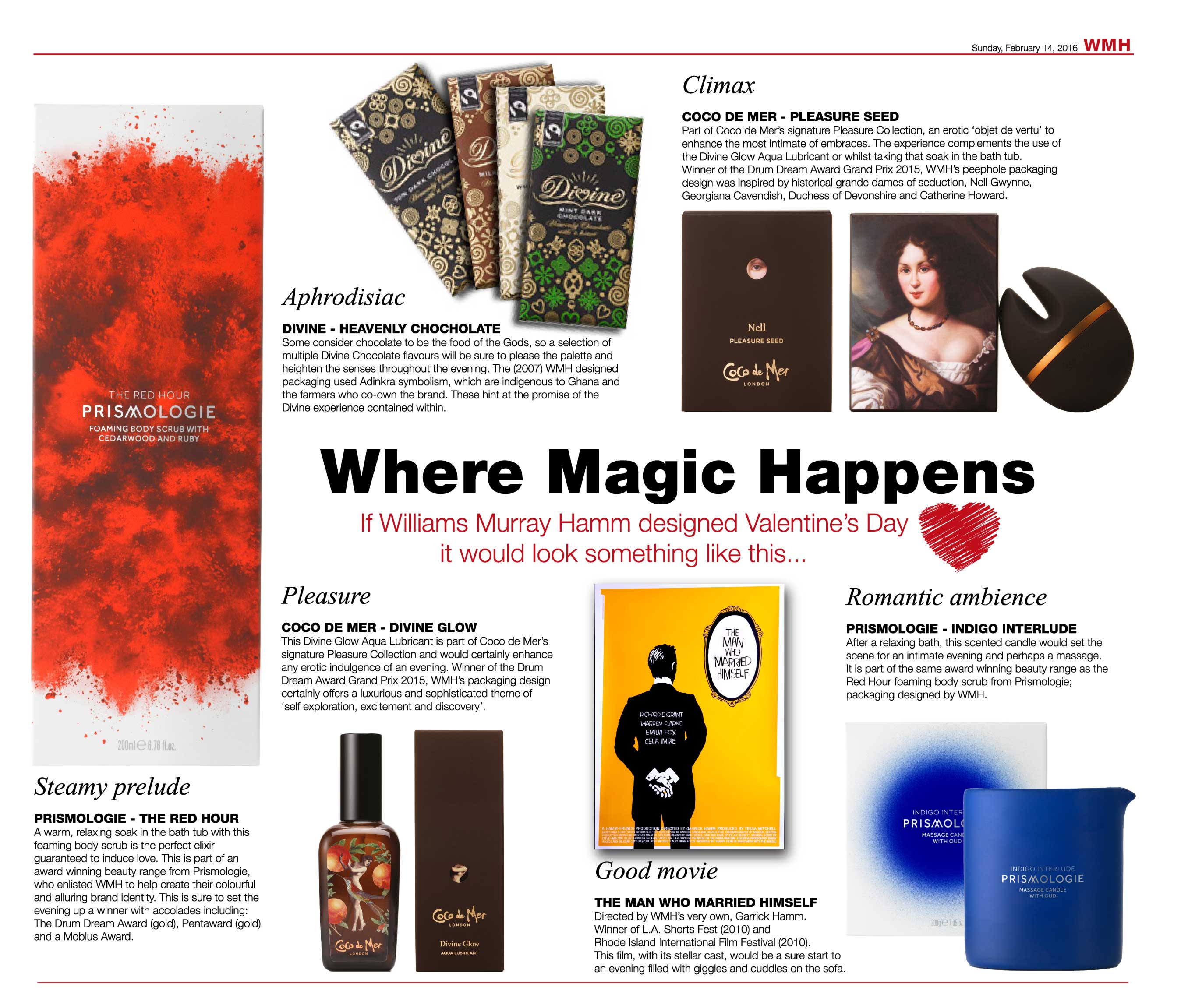
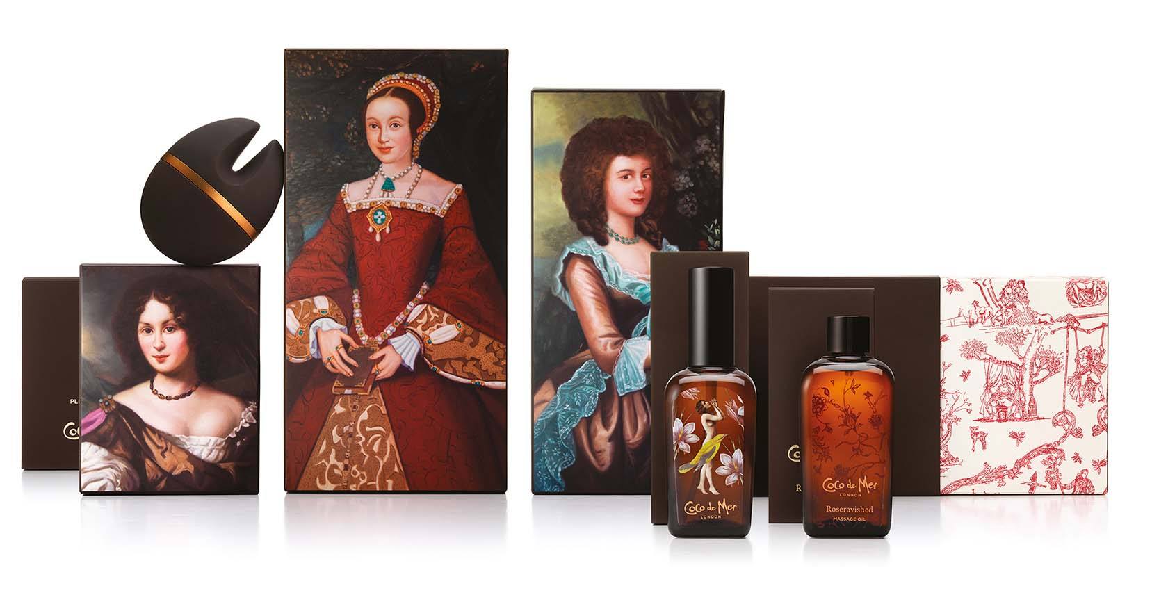 These feature erotic images of nude women, botanical prints and portraits of three historical figures whose sex lives were notorious: Catherine Howard, former Queen of England and wife of Henry VIII, who was beheaded for adultery; Georgiana Cavendish, the Duchess of Devonshire, whose affairs were portrayed in 2008’s film ‘The Duchess’; and Nell Gwynne, the long-term mistress of King Charles II.