WMH wins Silver at FAB Awards for Penny Market ‘Orto Mio’ redesign

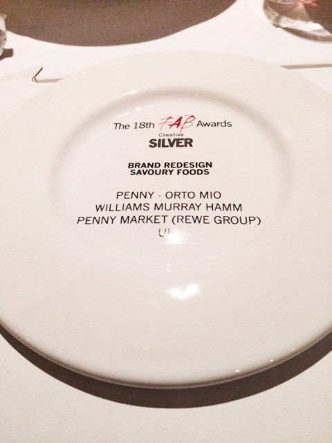
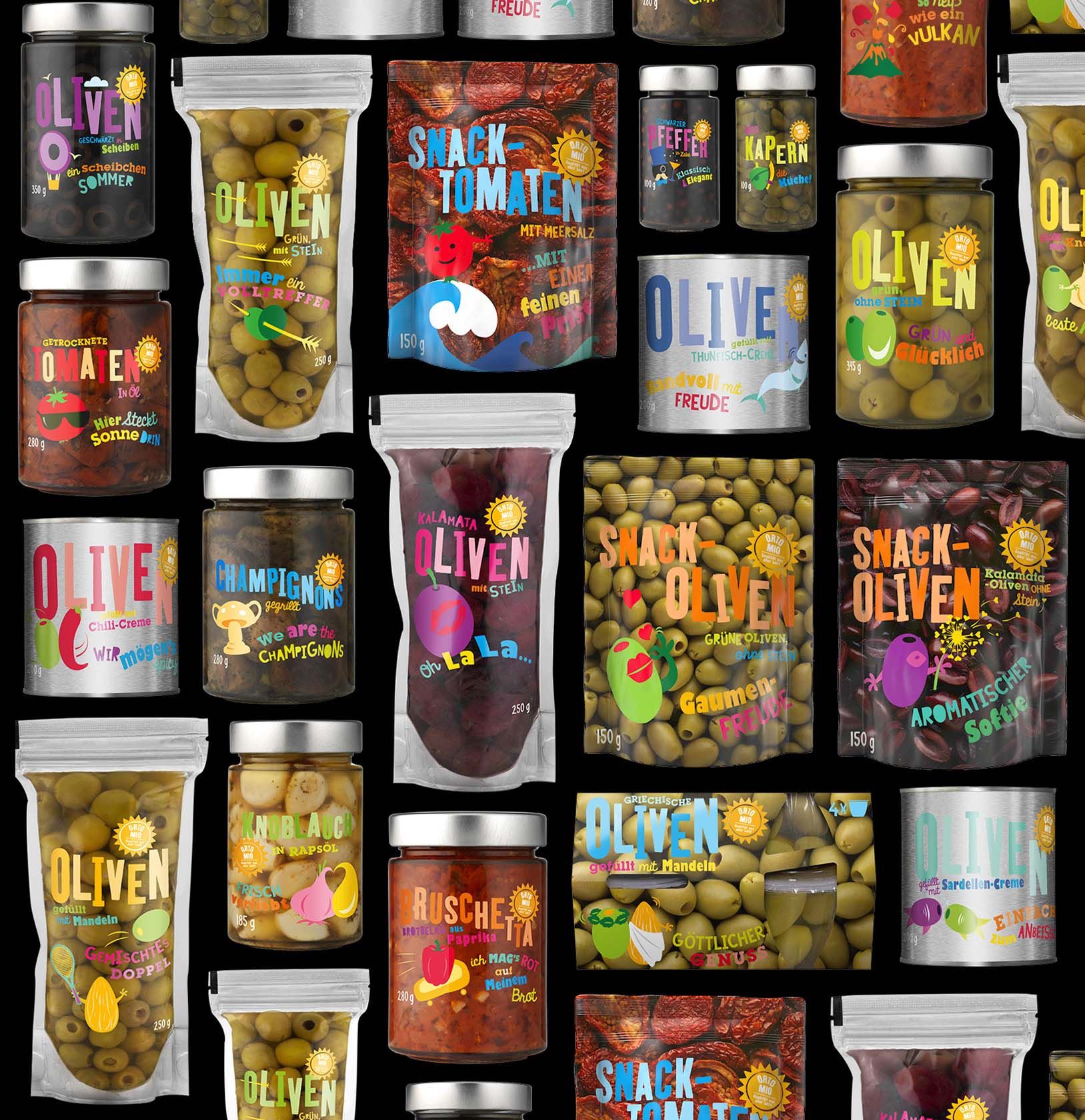
Williams Murray Hamm’s brave, bold and engaging design for Penny Market’s ‘Orto Mio’ antipasti range was awarded a Silver at last night’s International Food & Beverage Awards.

image2

Now in their 18th year, the FAB Awards are focused entirely on work done for Food and Beverage brands. They recognise the critical contribution that outstanding creative work makes in building brands, identifying and rewarding leading practitioners from over 60 countries.

Rewe owned, Penny operates 3,550 stores in Europe. Having won a written competitive pitch against two other agencies, WMH was appointed to rejuvenate the 45+ antipasti range to reflect a more unconventional and approachable image for Orto Mio.

WMH-PENNY-ORTO-MIO-REWE-BEFORE-AFTER-WEB

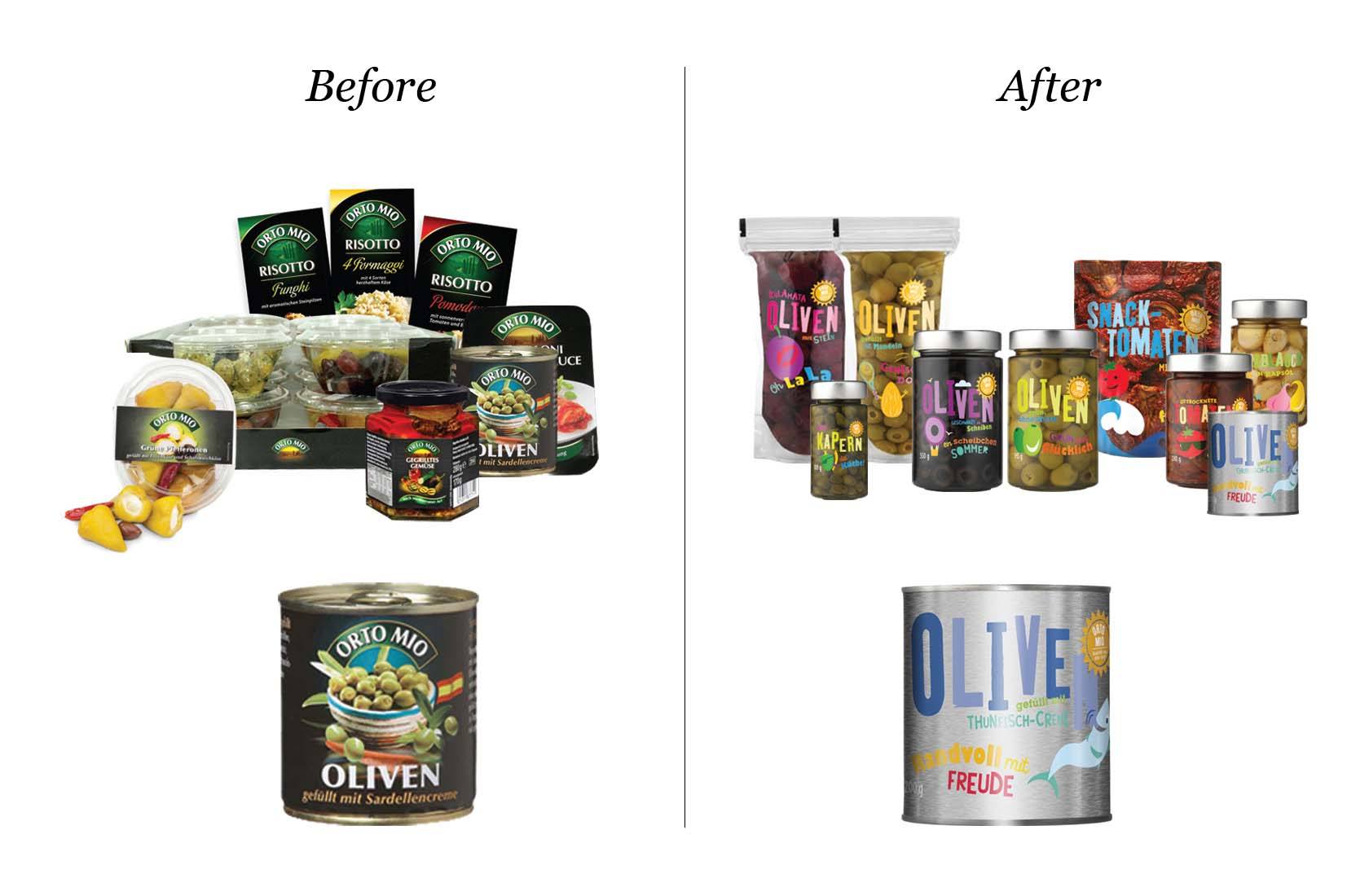
WMH’s new design embodies the relaxed, sociable style of eating antipasti. It suggests that the food can barely be restrained by its packaging and is bursting to get out with colour and flavour

WMH-PENNY-ORTO-MIO-REWE-JARS-WEB

The illustrations work in unison with lively, colourful hand drawn typefaces. Each product carries a witty copyline, such as ‘oh la la olives’, ‘we are the champignons’ and ‘you make me blush’, continuing the promise of an enjoyable eating experience.

On winning the award Garrick Hamm, Creative Director at WMH said:

“We are overjoyed that our work on ‘Orto Mio’ has been recognised by the FAB Awards.  Hopefully, the witty design raised as much of a smile on the judges’ faces, as the award has on ours!”

image1

WMH-PENNY-ORTO-MIO-REWE-WALLPAPER-WEB

LOVE / HATE: Of Lunatics and Asylums…

love-hate-williams-murray-hamm-wmh-blog


In 2010 Coca Cola relaunched as a response to declining sales of carbonated drinks. There was no change to the product, but there was substantial change to the way the brand was presented.

Out: went years of complicated, ugly packs, replete with multi textured swooshes, condensation and all the other fripperies of soft drinks branding.


coco-cola-packaging-2010-soft-drinks-WMH


In: came a new, stripped down design that used simple flat colours and a bold, plain white Coke marque.


coca-cola-coke-zero-diet-coke-soft-drinks-packaging-WMH


In: came campaign work that was a reminder of more innocent times when we all loved fizzy drinks.


coca-cola-summer-cans-soft-drinks-packaging-turner-duckworth-WMH

coca-cola-summer-cans-soft-drinks-truck-turner-duckworth-WMH


How clever of Turner Duckworth to get a piece of work this good and this simple, through a behemoth like Coca Cola.

Of course, in global businesses, there’s always someone who wants to make their mark. In March this year we saw major tweaks to the design starting to appear. Suddenly the logo on cans was horizontal and then Spain launched with each variant being red with a small part of the can given over to the variant type (black for zero, green for the execrable ‘Coke Life’ etc). It was horrid, but at least it looked as though it might be confined to Spain.

This week, Coke announced a complete redesign along Spanish lines. An ‘iconistic’ red disc now appears everywhere. Apparently it’s a ‘signature asset’. When fat words like these appear in press releases you know the head of design is about to go into hiding.


coca-cola-new-cans-soft-drinks-packaging-2016-WMH


This redesign is a ghastly mistake brought about by cost cutting; e.g. the ‘One Brand’ story and the fear of sugar taxes. The trouble is, the design doesn’t help. It damages the brand by reducing it to what it was in the past, complicated, ugly and spurious, losing Coke’s unique status along the way.

Launching in Mexico immediately and rolling out across the world in 2017 soon everyone associated with this rebranding will have moved on. They never get to reap what they sow nowadays. As usual, someone new will be left to pick up the pieces.


LOVE-HATE-COCA-COLA-BOTTLE-PACKAGING-WMH-RGB-1680


It proves that in today’s company structure, no matter how high flying your design management is, it doesn’t get listened to. This is a triumph of cost cutting management and poor use of ‘consumer insights’ over what’s good for the brand long term.

Many years ago, my late business partner, Richard Murray wrote to Coca Cola betting them his house that Minute Maid would fail in the market. It did. He’d be safe in betting on this new Coke design too.

Author: Richard Williams

If WMH designed Valentine’s Day…

WMH designed Valentine's Day

For press enquiries contact press@wmhagency.com 

WMH wins GOLD for JuiceBurst at the DBA Design Effectiveness Awards 2016

Williams Murray Hamm, with client Purity Soft Drinks, won gold for Brand Design with its groundbreaking work on JuiceBurst, at this year’s Design Effectiveness Awards.

DEA2016 gold WMH JuiceBurst stageshot

Recognised as one of the UK’s most prestigious design for business awards, Thursday night’s annual turnout was held at Tobacco Dock, London. The guest list of shortlisted winners included many of the top 20 creative and design businesses in this country.

Judged by business leaders and entered jointly by client and designer, the DBA Design Effectiveness Awards are both rigorous and authoritative. They celebrate the power of design to drive business success and provide compelling proof of why design is a sound commercial investment.

Popular with small, independent retailers, JuiceBurst was missing a massive opportunity by having no presence amongst large convenience retailers like WHSmith. In order to achieve significant retail listings to drive growth, WMH defined a target audience, positioned the brand and created highly differentiated packaging that would really engage consumers.

WMH, JUICEBURST, CONSUMERS, PURITY SOFT DRINKS, DE2016 AWARD, DBA

Building on the brand’s name, WMH used fruit being detonated as the central motif. This overarching idea connected the packaging to social media and digital content via Blippar, the augmented reality app.

JuiceBurst WMH Blippar DEA2016 DBA

Since re-launch, JuiceBurst has become one of the nation’s fastest growing beverage brands. In a market declining by -9%, it is growing at 93% year on year. There has been an amazing 75% annual profit increase and distribution has increased from one to nine national retailers.

WMH Creative Director Garrick Hamm said ‘It just illustrates, again, that great, simple creative ideas can make a difference to the bottom line. I’m delighted for our long-standing and supportive client Jon Evans at Purity and, of course, our hard working team at WMH’.

WMH, DBA, DEA2016, group photo, juiceburst

For press enquiries contact press@wmhagency.com or call +44 (0) 20 3217 0000.

(All images copyright of Williams Murray Hamm 2016, all rights reserved) 


I’m looking for simplicity

Lamb WestonI have discovered that, at the age of 66, I’m at the leading edge of thinking.

I’m behaving like a Millennial.

I was drawn to a poster for Nigella Lawson’s new book ‘Simply’ because simplicity has been on my mind lately. I’m clearing my life of things I don’t need.

If I love it, or it has serious sentimental value or it makes my life easier it stays, if not, it goes.

For years people have been telling me to buy a second home, but why do I want another set of windows to paint, lawn to cut and bills to pay? If I want a house for the occasional weekend, I’ll rent one.

I’m looking for a simpler, less stressful life.

According to Blake Morgan, in Forbes magazine, Millennials don’t want possessions, they want experiences. Go to the concert, but don’t burden yourself with buying the album. If you want to hear it, go on Spotify. If you need to get around, use public transport or pick up a ZipCar.

Technology is feeling the pain too. We’re keeping things longer. According to the WSJ, we’re buying fewer televisions because we’re watching TV on our tablets and we don’t see the value in upgrading to the latest TV gizmo every few years. The growth in SIM only deals is because that new phone upgrade and costly contract isn’t as tempting as it was. Do you really need to pay top dollar for a slightly better phone?

Clearly, this shift towards simplicity will have a serious effect on what we buy and, from a designer’s perspective it will make for an interesting time. Great design has always been about editing out the stuff that’s not relevant. It helps people make decisions by giving brands and businesses clarity in a complex world.

It’s what we’ve just done for Lamb Weston a huge potato business in the cut throat world of food services. we’ve got it down to one thing – ‘Seeing possibilities in potatoes’. Bingo!

Of course, we’re just being Millennial. It is time for the marketing world to catch up, to cut out the complication and ask ‘What’s the one thing you want people to understand about your brand and how can you get it into the heads of a busy distracted population?

Author: Richard Williams

WMH relaunches Lamb Weston to Middle East consumers

Lamb Weston

Following on from the creation of a new brand purpose and new visual identity for Lamb Weston’s global business, WMH was asked to introduce the new branding across its range of consumer potato products in the Middle East Market. 

In 2004-2005 Lamb Weston launched its Foodservice products in the Middle East retail sector to everyday consumers, though keeping the same identity which it had used for its Foodservice business customers.  The business has been growing steadily in the region. With top of mind awareness in both Foodservice market and Retail channels.

In July this year, WMH helped Lamb Weston relaunch its new global identity and positioning: to be the most inventive potato company in the world; a business that is always asking ‘What’s next?’; seeing possibilities in everything they do.  Through the design, WMH maintained the famous signature marque which was gently refined, with the significant addition of the ellipses symbolizing potatoes and the infinite possibilities they represent for Lamb Weston.

WMH’s task for the Middle East market was to develop a communications campaign using the new tagline of ‘Seeing Possibilities’ as well as the new identity to raise awareness and create genuine excitement and fun to consumers around this relaunch.

Using the inventive potato shaped ellipses, the range’s relaunch was brought to life across floor stickers, danglers, freezer dressing, other in-store communications and delivery trucks.  Visually stimulating, the inventive ellipses are shown as containers for Lamb Weston’s line of frozen potato products, smiling faces, parachutes, crazy hair.  Fries that literally surprise and represent a fun brand with an inventive heart.

Fadi Ayloush Brand Manager Retail ME, at Lamb Weston / Meijer said:

“Working with WMH was a great opportunity to establish a strong, creative business partnership. We felt there was sincere interest to work with us on building and creating a brand story for Lamb Weston® that would drive the Frozen Potato Category. This captures the essence of Lamb Weston’s approach – always moving forward with inventive solutions for improving its customer’s business”.

Into the Future

Showcasing the talents of the future.

As a recovering awards addict, I’ve judged, chaired and entered most creative shows around the globe, but the one closest and dearest to my heart is the D&AD Student Awards.

I was thrilled to be asked back to judge this year’s category ‘Make Your Mark’ and was so impressed with the work that I decided to give up our window space (usually reserved for talking about ourselves) to showcase this year’s nominations. We’ve called it ‘Tuned in to the Future’.

In many ways the Student Awards are more important than those for the professionals. The Pro awards are ‘post’ the event, a pat on the back from your peers. The Student Awards are about the future.

They remind us how to look at life in a different and original way, with a smile, tons of enthusiasm and a spirit that only bright young things can bring.

With more students graduating this year than ever, they need our support and we’re proud to be ‘Tuned into the Future’.

Check out more about the work from this talented bunch on our Facebook page.

Set to Burst

APPLE-BLUEBERRY2

We’ve always had a strong portfolio of ambitious small brands that can’t afford large ad budgets. They tend to see their packaging as media they own and come to us because we create campaignable ideas that they can make noise with.

Purity Soft Drinks is typical of this kind of client. They have huge ambitions for their JuiceBurst brand, which is loved by newsagents across the land, but so completely anonymous that few consumers would recognise it.

We were hired, initially, to develop the brand strategy and packaging, but the work has taken us much further and into the realms of film-making, SFX and augmented reality.

JuiceBurst looked like an own label product in a clunky bottle. The only way we could make it behave like a brand was create an identity based on the one thing it could own – the best juice on the shelf having a bit of an outburst. The idea’s in the name.

Because we’re such an ideas driven business, people don’t realise that we love designing pack structures. In this case we created a big fat, juicy shape that glugs effortlessly – JuiceBurst is a big drink.

All along, it was clear that we could do so much more with the brand than redesign it. Squeezing the pips of the marketing budget (we just had to get that in) we worked with Artem, the firm behind many of the special effects of the Olympics ceremonies. They became expert at detonating fruit while Matt Broad caught it all on high speed, HD film. Lisa Desforges wrote the witty outbursts and Frank Pescod did his magic on the musical front.

The result is a range of films with beautiful, real fruit bursting in all their glory. A still of the film is used on each label and you can watch a short documentary film of how we did it, a must see. How could you resist watching grown men blow up fruit? It’ll be as big as ‘Buttrocket’, only messier. See the making-of film here.

Blippar™ is a phone app that recognises features of a label, or newspaper and brings it to life. In the case of JuiceBurst, you point your smartphone at the label and you’re presented with interactive graphics that turn with the bottle and offer you games, win prizes or let you watch the ‘How We Made JuiceBurst’ short film.

Working closely with the guys at Blippar, we’re proud to present the first ever augmented-reality enabled soft drinks packaging. See all the fruit bursting films here.

Eng day

This is the gallery of Exploding fruit.

VIEW ON FACEBOOK