LOVE / HATE: Karaoke’s Not Serious Marketing

How it’s put a spanner in the works for Chris Evans.

Top Gear has been “Bjorn Again” but it’s just not Buddy Holly.  Richard Williams explores relaunched brands who have attempted to rediscover their illustrious past.

LOVE-HATE-TOPGEAR-FACEBOOK-WMH-WEB
Call me an old fashioned blokey chap. I loved Top Gear with Clarkson, Hammond and May. I hated a lot of the actual driving stuff, but I really loved the banter. Here were three top motoring journalists who felt entirely comfortable with each other. Anyone can do stupid things like catapult cars or set fire to caravans, but it’s the way they played it. It was the in-jokes they let us in on that were so funny. They were our chums and we sat on the edge of our seats waiting for what we knew would be the next excruciating utterance.

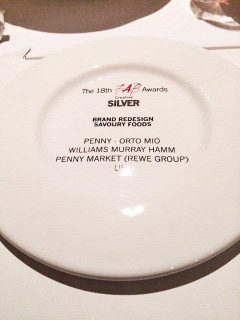
There’s a parallel to life in our studio. We all know each other so well. A raised eyebrow, an admonishing cough, a riff about Reggie Perrin and we’re off. Irreplaceable. It’s hard to join WMH simply because it takes years to learn the stories.

Watching the new Top Gear is like watching Bjorn Again, the US version of ‘The Office’ or seeing ‘Buddy’. There’s something seriously wrong. It’s not Abba or Ricky Gervais and it’s certainly not Buddy Holly (he’s been dead for 57 years) it’s Karaoke.

Bjorn-Again-Top-Gear-Karaoke-Not-Serious-Marketing-Abba-Chris-Evans-WMH-web
© copyright 2016 Bjorn Again (cited via http://www.littlestepsasia.com)

The same is often true of businesses and brands when they try and relaunch to rediscover their illustrious past.

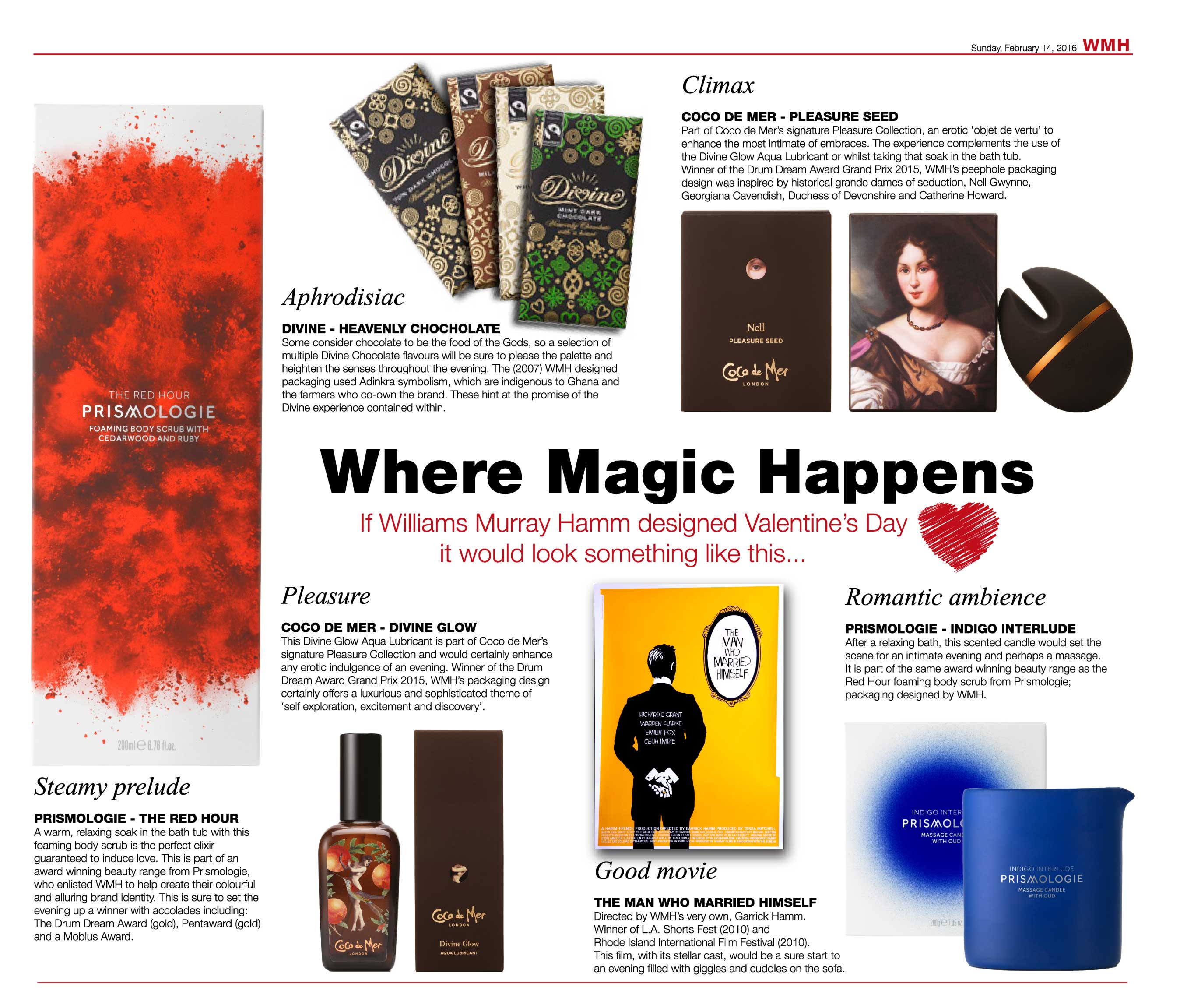
Phileas Fogg was a clever, entrepreneur-led snack brand that introduced the UK to posh crisps. So successful was it that United Biscuits bought it and wrecked it in very short order.

phileas-fogg-corn-chips-Karaoke-Not-Serious-Marketing-Abba-Chris-Evans-WMH-SHORT
© copyright 2016 Phileas Fogg / KP Snacks

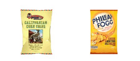
As Kettle, Tyrrell’s and a plethora of smaller brands surrounded it, it tried again and again to relaunch (we even had a go at it) but it had lost its sparkle, its point of difference, its raison d’etre. Now, it’s been relaunched yet again. The products are actually very good, but it’s a pale imitation of its former self with unfunny TV ads and dreadful packaging. It’s a poor pastiche of the past.

For many years, Trustees Saving Bank, latterly the TSB, was a common sight on our high street. It was the bank that “Likes To Say Yes”. It disappeared, having become part of Lloyd’s Banking Group, went into oblivion and was resuscitated in 2013 and subsequently sold to a Spanish business.

TSB-Karaoke-Not-Serious-Marketing-Abba-Chris-Evans-WMH
© copyright 2016 TSB / Banco Sabadell

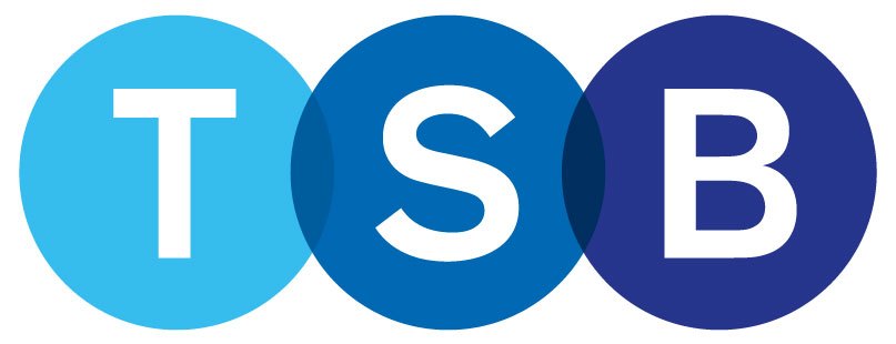
What’s it there for? We’d all survived quite happily without it. Apparently the Spanish think the name has ‘traction’. I think it looks like ‘The Bank Nobody Goes Into’.

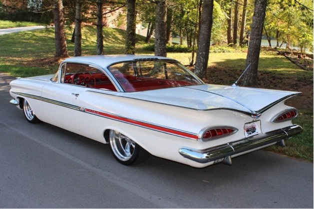
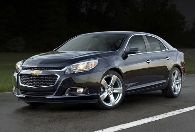
Returning to the car theme, I’ll finish with an example of a car that should have been dead and buried years ago. As a kid, I loved the Chevrolet Impala. How could you not be drawn to its spaceship styling? Its rear wings reached into the middle of its vast boot and radiated out in a whoosh of glory. This was not a normal car – it moved when it was standing still. I wore the wheels out of my Dinky version.

Chevrolet-Impaladeli-classic-Karaoke-Not-Serious-Marketing-Abba-Chris-Evans-WMH
Image source citation pending

Have you seen 2016’s Impala? Don’t bother. It looks like the illegitimate spawn of a Vauxhall and a Mazda – only worse.

Chevrolet-Impaladeli-2016-Karaoke-Not-Serious-Marketing-Abba-Chris-Evans-WMH
© copyright 2016 Chevrolet

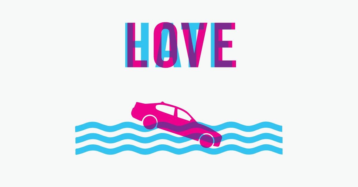
Don’t misunderstand me, there are huge numbers of brands that relaunch very successfully because they understand what makes them different and get how we can continue to be in love with them, but New Top Gear isn’t anywhere near.

Top Gear, at its best, was about unlikely friendships born through a common love of cars. As a car nut or football fan, you can understand that uniting bond, despite the obvious differences between the people. Chris Evans and TFI Friday, at its best, was like that too – Chris and his workmates, feeding off the energy of a Friday night; beer, banter, music, idiotic drunken tomfoolery…. Perhaps he needs to get some of his real mates back and forget the international starring line-up.


Author: Richard Williams.

For any press enquiries email press@wmhagency.com  or call +44 (0) 20 3217 0000.

Unless otherwise cited, © copyright 2016 Williams Murray Hamm, all rights reserved.

LOVE / HATE: Amazon Fresh and the ‘First Moment of Truth’

‘Is it curtains for design agency claptrap?’ 

Following the recent UK launch of Amazon Fresh, Richard Williams and Garrick Hamm explore the Love and Hate of the brand packaging ‘First Moment of Truth’ in the digital age on online grocery shopping.

LOVE_HATE_AMAZON_FRESH_JUNE_DUEL_WEBSITE

Hate: Packaging

WMH-RICHARD-WILLIAMS-PROFILE-WEB

Many years ago, Procter and Gamble came up with the idea of ‘The First Moment of Truth’.

This was all about how packaging works in the supermarket and how first impressions really count. I can’t remember what the second and third moments of truth were, something about bar codes probably.

I wonder what P&G thinks about the FMOT of their brands as they appear in online shopping. Does it bring on an FMOH (First Moment of Horror)? Here’s the truth. Brands look dreadful on Ocado and as we’re about to be invaded by Amazon Fresh they need to do something now.

Since it’s only partially available in the UK, I had to pretend to live in the Empire State Building (ZIP code 10118) to be able to access it. What is glaringly obvious is that, if Amazon Fresh really takes off, (the British Retail Consortium predicts that 900,000 jobs will be lost by 2025 as the industry moves online) the claptrap and mumbo jumbo that packaging design agencies have peddled for years, in an effort to cover up their lack of creativity, will have no further use.

Amazon-Fresh-launch-WMH-Love-Hate

There is no ‘shelf blocking’ since there aren’t any shelves to block and you can’t see any ‘category cues’ or ‘appetite appeal’ because the pack shots are so tiny, the copy is illegible and everything is low res. The game’s up. Brands have to find a new way to work for online shopping and it’s a wonderful, thrilling opportunity.


Love: Smiles 

WMH-GARRICK-HAMM-PROFILE-WEB

Hopefully Amazon Fresh really will lead to a completely different way of presenting brands on screen.  They’re going to have to look at simple visual mnemonics. It could even lead to a new golden era where intelligent, meaningful logos represent a brand instead of dull old packaging.

Actually, this is really just a gratuitous excuse to talk about the recently updated ‘A Smile in the Mind’. Along with Alan Fletcher’s ‘The Art of Looking Sideways’ it is one of the must-have books on engaging, intelligent design. I’ve always loved those clever little logos that give a business personality.

The original Spratt’s pet food logo is clunky and artless, but incredibly endearing. Dog happiness is built right into it. I also came across this little beauty for Knapp Shoes (obviously) by Chermayeff & Geismar Inc. in New York. It’s a lovely witty mark. Simple and clever. How could you resist? Similarly, Norbert Dutton’s 1959 logo for electronics business, Plessey, is something we’d be proud to have done today.

Plessey-spratts-knapp-shoes-logos-WMH-Love-Hate-THREE

(left) Spratts – Logo designed by Max Field-Bush (UK). Copyright (second extension) 2016, Julien Clairet of DATA ACCESS Paris. / (middle) Knapp Shoes – Logo designed by Charmayeff & Geismar Inc. / (right) The Plessey Company Ltd – Logo designed by Norbert Dutton’s 1959


With wit like this, think what you could do for a brand like Bird’s Eye or Flash. We won’t see the end of supermarket packaging by any means and I fear that we won’t lose steamy shots of soup and stringy cheese slices on pizza packs, but perhaps Amazon Fresh, unwittingly, will lead to a design revolution where we go back to intelligent, beautifully thought through brand identities.

I can’t wait.


Authors: Richard Williams & Garrick Hamm. 

For any press enquiries email press@wmhagency.com or call +44 (0) 20 3217 0000.

Unless otherwise cited, © copyright 2016 Williams Murray Hamm, all rights reserved.

WMH wins Silver at FAB Awards for Penny Market ‘Orto Mio’ redesign

Williams Murray Hamm’s brave, bold and engaging design for Penny Market’s ‘Orto Mio’ antipasti range was awarded a Silver at last night’s International Food & Beverage Awards.

image2

Now in their 18th year, the FAB Awards are focused entirely on work done for Food and Beverage brands. They recognise the critical contribution that outstanding creative work makes in building brands, identifying and rewarding leading practitioners from over 60 countries.

Rewe owned, Penny operates 3,550 stores in Europe. Having won a written competitive pitch against two other agencies, WMH was appointed to rejuvenate the 45+ antipasti range to reflect a more unconventional and approachable image for Orto Mio.

WMH-PENNY-ORTO-MIO-REWE-BEFORE-AFTER-WEB

WMH’s new design embodies the relaxed, sociable style of eating antipasti. It suggests that the food can barely be restrained by its packaging and is bursting to get out with colour and flavour

WMH-PENNY-ORTO-MIO-REWE-JARS-WEB

The illustrations work in unison with lively, colourful hand drawn typefaces. Each product carries a witty copyline, such as ‘oh la la olives’, ‘we are the champignons’ and ‘you make me blush’, continuing the promise of an enjoyable eating experience.

On winning the award Garrick Hamm, Creative Director at WMH said:

“We are overjoyed that our work on ‘Orto Mio’ has been recognised by the FAB Awards.  Hopefully, the witty design raised as much of a smile on the judges’ faces, as the award has on ours!”

image1

WMH-PENNY-ORTO-MIO-REWE-WALLPAPER-WEB

LOVE / HATE: Of Lunatics and Asylums…

love-hate-williams-murray-hamm-wmh-blog


In 2010 Coca Cola relaunched as a response to declining sales of carbonated drinks. There was no change to the product, but there was substantial change to the way the brand was presented.

Out: went years of complicated, ugly packs, replete with multi textured swooshes, condensation and all the other fripperies of soft drinks branding.


coco-cola-packaging-2010-soft-drinks-WMH


In: came a new, stripped down design that used simple flat colours and a bold, plain white Coke marque.


coca-cola-coke-zero-diet-coke-soft-drinks-packaging-WMH


In: came campaign work that was a reminder of more innocent times when we all loved fizzy drinks.


coca-cola-summer-cans-soft-drinks-packaging-turner-duckworth-WMH

coca-cola-summer-cans-soft-drinks-truck-turner-duckworth-WMH


How clever of Turner Duckworth to get a piece of work this good and this simple, through a behemoth like Coca Cola.

Of course, in global businesses, there’s always someone who wants to make their mark. In March this year we saw major tweaks to the design starting to appear. Suddenly the logo on cans was horizontal and then Spain launched with each variant being red with a small part of the can given over to the variant type (black for zero, green for the execrable ‘Coke Life’ etc). It was horrid, but at least it looked as though it might be confined to Spain.

This week, Coke announced a complete redesign along Spanish lines. An ‘iconistic’ red disc now appears everywhere. Apparently it’s a ‘signature asset’. When fat words like these appear in press releases you know the head of design is about to go into hiding.


coca-cola-new-cans-soft-drinks-packaging-2016-WMH


This redesign is a ghastly mistake brought about by cost cutting; e.g. the ‘One Brand’ story and the fear of sugar taxes. The trouble is, the design doesn’t help. It damages the brand by reducing it to what it was in the past, complicated, ugly and spurious, losing Coke’s unique status along the way.

Launching in Mexico immediately and rolling out across the world in 2017 soon everyone associated with this rebranding will have moved on. They never get to reap what they sow nowadays. As usual, someone new will be left to pick up the pieces.


LOVE-HATE-COCA-COLA-BOTTLE-PACKAGING-WMH-RGB-1680


It proves that in today’s company structure, no matter how high flying your design management is, it doesn’t get listened to. This is a triumph of cost cutting management and poor use of ‘consumer insights’ over what’s good for the brand long term.

Many years ago, my late business partner, Richard Murray wrote to Coca Cola betting them his house that Minute Maid would fail in the market. It did. He’d be safe in betting on this new Coke design too.

Author: Richard Williams

If WMH designed Valentine’s Day…

WMH designed Valentine's Day

For press enquiries contact press@wmhagency.com 

Into the Future

Showcasing the talents of the future.

As a recovering awards addict, I’ve judged, chaired and entered most creative shows around the globe, but the one closest and dearest to my heart is the D&AD Student Awards.

I was thrilled to be asked back to judge this year’s category ‘Make Your Mark’ and was so impressed with the work that I decided to give up our window space (usually reserved for talking about ourselves) to showcase this year’s nominations. We’ve called it ‘Tuned in to the Future’.

In many ways the Student Awards are more important than those for the professionals. The Pro awards are ‘post’ the event, a pat on the back from your peers. The Student Awards are about the future.

They remind us how to look at life in a different and original way, with a smile, tons of enthusiasm and a spirit that only bright young things can bring.

With more students graduating this year than ever, they need our support and we’re proud to be ‘Tuned into the Future’.

Check out more about the work from this talented bunch on our Facebook page.

Set to Burst

APPLE-BLUEBERRY2

We’ve always had a strong portfolio of ambitious small brands that can’t afford large ad budgets. They tend to see their packaging as media they own and come to us because we create campaignable ideas that they can make noise with.

Purity Soft Drinks is typical of this kind of client. They have huge ambitions for their JuiceBurst brand, which is loved by newsagents across the land, but so completely anonymous that few consumers would recognise it.

We were hired, initially, to develop the brand strategy and packaging, but the work has taken us much further and into the realms of film-making, SFX and augmented reality.

JuiceBurst looked like an own label product in a clunky bottle. The only way we could make it behave like a brand was create an identity based on the one thing it could own – the best juice on the shelf having a bit of an outburst. The idea’s in the name.

Because we’re such an ideas driven business, people don’t realise that we love designing pack structures. In this case we created a big fat, juicy shape that glugs effortlessly – JuiceBurst is a big drink.

All along, it was clear that we could do so much more with the brand than redesign it. Squeezing the pips of the marketing budget (we just had to get that in) we worked with Artem, the firm behind many of the special effects of the Olympics ceremonies. They became expert at detonating fruit while Matt Broad caught it all on high speed, HD film. Lisa Desforges wrote the witty outbursts and Frank Pescod did his magic on the musical front.

The result is a range of films with beautiful, real fruit bursting in all their glory. A still of the film is used on each label and you can watch a short documentary film of how we did it, a must see. How could you resist watching grown men blow up fruit? It’ll be as big as ‘Buttrocket’, only messier. See the making-of film here.

Blippar™ is a phone app that recognises features of a label, or newspaper and brings it to life. In the case of JuiceBurst, you point your smartphone at the label and you’re presented with interactive graphics that turn with the bottle and offer you games, win prizes or let you watch the ‘How We Made JuiceBurst’ short film.

Working closely with the guys at Blippar, we’re proud to present the first ever augmented-reality enabled soft drinks packaging. See all the fruit bursting films here.

Eng day

This is the gallery of Exploding fruit.

VIEW ON FACEBOOK